• Sign up or login, and you'll have full access to opportunities of forum.

Filtered And Artistic Manips And Pictures Gallery

Go to CruxDreams.com
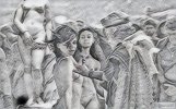
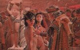
Two beautiful girls being inspected by a local aristocrat in the slave markets.
View attachment 931835


Further to this issue of trying to get a realistic painting effect, different editors provide different results and less is often more.
This image is the same as above, but with a very light-touch "oil paint" filter applied in Photoshop:
View attachment 931836

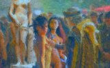
On the other hand, this is the oil paint effect from the FastStone imageviewer (also applied lightly):
View attachment 931837

Both give a nice sort of painting effect, but it really depends on what you're going for.
SlaveMarket2a_c.jpgSlaveMarket2a_d.jpgSlaveMarket2a_e.jpg

SlaveMarket2a_f.jpgSlaveMarket2a_g.jpgSlaveMarket2a_h.jpg
 
Two beautiful girls being inspected by a local aristocrat in the slave markets.
SlaveMarket2a.jpg
Yes, it is a matter of personal preference Jolly. Personally I prefer the second one in getting that oil painting effect, but it does render some of the details less clear. The first oil painting pic is possibly more artistic.
In situations like that when a filter I want to use obscures some small features, say eyes or nipples or something of the sort, I apply a mask and paint out very small parts of the filter, allowing detail from an underlying layer to come through.
A great image, Jolly - with convincing lighting and character interaction. Ariel and her friend are looking directly at us in an appealing manner. It seems they do not wish to be bought by this prospective owner! The inclusion of Hiram Powers' Greek Slave is highly original - the colouring and lighting of the statue are very effective. The sculpted head is cropped out, which avoids instant identification, and the only giveaway is the pale colour of her chains. Nevertheless, this is truly excellent work resulting in a beautiful image! :)

I would agree that, as you say, 'less is often more' when it comes to filter effects. They can be useful as blenders to improve the overall visual consistency of an image with multiple components, but they are very obvious if they are heavily applied. I sometimes combine artistic filters as extra top layers, set at reduced opacity.

Now we're all making new interpretations of your picture! ;) Here is your starting point, 'SlaveMarket2a', with your two filtered versions layered over it, each at 33% opacity -

Jollyrei SlaveMarket2abc.jpg
 
They (Simon and Garfunkel) said there must be 50 ways to leave your lover. 51 now. :D

50Ways-1d.jpg
This is a particularly good example of character interaction, employing an unusual pose by Ariel. Petter Hegre's original source image is almost in the backstage category, since it shows her preparing to begin the session and not consciously posing at all. But in the new crux scene, her natural pose and expression are perfect for conveying the satisfaction of the femme fatale who has not only lured the male to the cross, but nailed him up and discarded the hammer on completion of the task. Her broad smile and averted gaze are focused on the male sexual organ, which is now failing to respond to her own sexually charged nudity.

Ariel is blended into the new background with such perfection that she appears to be part of the original scene. She casts a shadow upon the stony ground which has been developed from the studio figure with commendable accuracy for the new environment. This manipulation has presented a number of challenges in terms of the consistent lighting direction, colour balance and saturation. However, the viewer is presented with a remarkably cunning composition and the result is a highly original image.

Beware of beautiful women bearing hammers... Very nice work, Jolly! :D
 
Her broad smile and averted gaze are focused on the male sexual organ, which is now failing to respond to her own sexually charged nudity.

Don't worry Bob, I imagine that's lube she is rubbing between her hands there, she clearly has the intention of attracting his interest, or getting a rise out of him shall we say.

Imaginative and effective
 
Waiting her turn to go out into the arena. This is her big day, after all.

View attachment 995625
That's really good. She has heard the screams, seen others led out there, and now she's next. Perfect expression on her face, and he hardly looks like the empathetic type. The crowd is waiting!
 
Waiting her turn to go out into the arena. This is her big day, after all.

ArielCaptive02a1a.jpg
One of your regular muses, Cruxton starlet Ariel presents a suitably defensive pose and a stunned facial expression in this scene of tension and anticipation. The effect is literally one of tunnel vision. We observe Ariel in close up, and gradually take in the Roman escort, the open gates, the entrance to the arena - and outside, we witness the fate which awaits her. Each element is neatly related and composed, with close attention to convincing colour balance and scale.

Ariel is not quite ready to turn around and face the future, but when she does, it will be relatively short. There is a sense of visual depth and a powerful, narrative quality in this picture which make it fascinating and compelling. The more I look at it, the more I like it. This is another one of your classic compositions - nice work, Jolly!
 
We observe Ariel in close up, and gradually take in the Roman escort, the open gates, the entrance to the arena - and outside, we witness the fate which awaits her.
I gotta admit I’m more interested in the source image for that there awaiting fate. ;) :babeando:
 

Attachments

  • 4748D2AA-65FF-404A-A1D2-7AD89E36BC15.jpeg
    4748D2AA-65FF-404A-A1D2-7AD89E36BC15.jpeg
    28.8 KB · Views: 556
I'll see what I can do for you, but my recollection is that she was a sort of random find, and there are no good hi-res images of her in that pose.
I thought she might be a Femjoy shot I found some time ago, but apparently not.

I do wish I could find more like her. :babeando:
 

Attachments

  • 9795034A-81C2-4602-8385-F956BC922D69.jpeg
    9795034A-81C2-4602-8385-F956BC922D69.jpeg
    197.7 KB · Views: 513
  • FE4C1BF4-F40F-4185-A854-F1A0CFE4EE31.jpeg
    FE4C1BF4-F40F-4185-A854-F1A0CFE4EE31.jpeg
    18.1 KB · Views: 477
I thought she might be a Femjoy shot I found some time ago, but apparently not.

I do wish I could find more like her. :babeando:
This is the original image I was working with. Even in this size, it has clearly been enlarged from a smaller image. No amount of Googling or reverse image searching has so far provided any better results. And I have no clue who she is. It seems to be part of a fitness or massage scenario.
CB359674.jpeg
 
Something from a bit of a different perspective. Is the viewer part of the crowd, or perhaps on another cross?
These people seem quite settled in to watch whatever happens, in any case.
View attachment 1005883
I’m guessing the view, which seems to be from a height similar to that of the other condemned, is from a third cross. It is an interesting perspective.
 
Something from a bit of a different perspective. Is the viewer part of the crowd, or perhaps on another cross?
These people seem quite settled in to watch whatever happens, in any case.
YanaCrux2c-2.jpg
Yana hangs on the right, with black hair and a distinctive tattoo, but I have not so far identified her friend, crucified on the left. I suspect both figures and their crosses are separately applied components. I am also aware of a very complex rearrangement of the figures in the background - and I think this must have involved considerably more work than the crux figures in the foreground. As viewers, we often take backgrounds for granted, although a successful composition frequently relies on careful modifications to all areas of a manipulation for maximum visual impact.

The lighting presents a convincing combination of direct sunlight on the audience, and shaded conditions, consistent with a passing cloud, for the foreground figures. Their discomfort makes a stark contrast with the crowd seated on the hillside. The close cropping of the main subjects and the lack of a visible horizon contribute to a disorientating effect, which is appropriately dramatic.

The background plays an important part in this particular image, since it contains the visible faces of the audience - and no faces are visible on the foreground subjects, since they are cropped out. Our gaze meets the eyes of the audience, implying that as viewers, we are indeed among the crucified. Nice work, Jolly - you are certainly specialising in unusual and interesting viewpoints for your crux manips! :)
 
Back
Top Bottom