-
Sign up or login, and you'll have full access to opportunities of forum.
You are using an out of date browser. It may not display this or other websites correctly.
You should upgrade or use an alternative browser.
You should upgrade or use an alternative browser.
Original Manipulations by Cruxforums Members
- Thread starter Wragg
- Start date

1972Golgatha
Assistant executioner
two siblings and a friend of them...?
two siblings and a friend of them...?
Yes Alice and Alica.
1972Golgatha
Assistant executioner
... ah the well-known insurgents - I am glad they were caught and crucified!Yes Alice and Alica.
Nicely done double-Alice.
 Which castle or wall is this? Nice background.
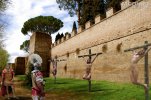
Vika and Alice are the Cruxdreams models (both from 2007) who feature in this dramatic roadside crux scene, outside the city walls. This might be the ancient walls of Rome, near the Porta Appia, the entrance of the Appian Way?
The five inserted figures are neatly extracted and inserted with due consideration to scale and lighting. Particularly realistic are the new shadows for three of the figures, indicating sunlight from upper left, in accordance with the background. The right hand crux figure is slightly desaturated and demonstrates how unified the overall colouring is within the manipulation. Nice work, Madi!

Nicely done double-Alice.Which castle or wall is this? Nice background.
Aurelian Walls of Rome near Piramide Cestia and Porta San Paolo. The walls were built during the Crisis of the Third Century.
I found today the image and thought, good place for crucifixes.mp5stab
Hair and Nails
If I can get an hdri of that, I will die happy. But also I’m a 3d artist! I can just make a replica can’t I?Aurelian Walls of Rome near Piramide Cestia and Porta San Paolo. The walls were built during the Crisis of the Third Century.
I found today the image and thought, good place for crucifixes.
lember
Magistrate
nice
delete a bit from her neck with a 4-8 px feather, it will be attached more smoothly
lember
Magistrate
I`m just posting a story with a place like thisIf I can get an hdri of that, I will die happy. But also I’m a 3d artist! I can just make a replica can’t I?
mp5stab
Hair and Nails
Like, you are worrying a story with a city wall location? Or you are nearby and could take a shot?I`m just posting a story with a place like this
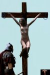
You are revisiting a scene from your acclaimed, illustrated story, 'Alice Barabbas' - and not for the first time! Within a few months of publishing the original story, you presented a fully revised version with improved manips and narrative detail. And now you have created a new variation of a highlight from the Golgotha sequence - specifically a development of frame #51. I believe a suitably dark and foreboding development of Gadriella's cross has been used, which if so, indicates a recent creation.
This is a most worthwhile undertaking, and it reveals the considerable refinement of your technique since the early days (not so very long ago, in fact). The original 'Alice Barabbas' pictures are remarkable for the ambition and complexity of their composition, being created to all intents and purposes by an absolute beginner. Now that you have mastered the medium, it becomes difficult to identify precisely which techniques you have employed.
I think this one probably uses a combination of linear cutting and masking. The hi-res presentation is bold, considering that the dimensions of the major components have been doubled, but the unified result ensures that there is no apparent loss of clarity. The crux figure pose is characteristic in showing Alice's feet straddling the stipes. I am not aware of any other manip artist presenting her in this way and in the interests of consistency, this is how you have always shown her.
The figure of Alice is substantially a pose sourced from her Makar series, with the ropes deleted, wrists reconstructed, nailed and bloodstained. The position of both lower legs has been adjusted either by warping or rotating as superimposed layers. Attention to detail includes the lifting eyes on the patibulum and slight distorion of the nail shanks penetrating the heels.
Lighting, saturation and scale are all consistent, and the beauty of the image lies in its simplcity. The two figures interact with an exchange of looks, and possibly words. Full ceremonial dress contrasts with full frontal nudity, and half of the picture consists of empty sky. Congratulations on a powerful composition, Wragg!

lember
Magistrate
or I`m not native american speaker and talking stupid things?Like, you are worrying a story with a city wall location? Or you are nearby and could take a shot?
What I tried to express is that this wall reminds me of the Punishment Bastion in this thread of mine.
but I could take some shot too earlier
He did? I must check this out.Within a few months of publishing the original story, you presented a fully revised version with improved manips and narrative detail.
The 'Version 2' remake of Wragg's story begins on page 9 of his 'Alice Barabbas' thread -He did? I must check this out.
Alice Barabbas
You're (ahem) dead right! :D I might have to use that pic as my avatar. ;) :)
www.cruxforums.com
Hi Lember, perhaps Mp5stab's auto-correct is confusing her message? I think she may be asking for somebody to take photos of the Roman walls.or I`m not native american speaker and talking stupid things?
What I tried to express is that this wall reminds me of the Punishment Bastion in this thread of mine.
but I could take some shot too earlier

Thanks Bob!You are revisiting a scene from your acclaimed, illustrated story, 'Alice Barabbas' - and not for the first time! Within a few months of publishing the original story, you presented a fully revised version with improved manips and narrative detail. And now you have created a new variation of a highlight from the Golgotha sequence - specifically a development of frame #51. I believe a suitably dark and foreboding development of Gadriella's cross has been used, which if so, indicates a recent creation.
This is a most worthwhile undertaking, and it reveals the considerable refinement of your technique since the early days (not so very long ago, in fact). The original 'Alice Barabbas' pictures are remarkable for the ambition and complexity of their composition, being created to all intents and purposes by an absolute beginner. Now that you have mastered the medium, it becomes difficult to identify precisely which techniques you have employed.
I think this one probably uses a combination of linear cutting and masking. The hi-res presentation is bold, considering that the dimensions of the major components have been doubled, but the unified result ensures that there is no apparent loss of clarity. The crux figure pose is characteristic in showing Alice's feet straddling the stipes. I am not aware of any other manip artist presenting her in this way and in the interests of consistency, this is how you have always shown her.
The figure of Alice is substantially a pose sourced from her Makar series, with the ropes deleted, wrists reconstructed, nailed and bloodstained. The position of both lower legs has been adjusted either by warping or rotating as superimposed layers. Attention to detail includes the lifting eyes on the patibulum and slight distorion of the nail shanks penetrating the heels.
Lighting, saturation and scale are all consistent, and the beauty of the image lies in its simplcity. The two figures interact with an exchange of looks, and possibly words. Full ceremonial dress contrasts with full frontal nudity, and half of the picture consists of empty sky. Congratulations on a powerful composition, Wragg!

The other day my alerts showed a like for the original in the Alice Barabbas sequence, so I went back for a look and thought, 'ouch!' I'd smudged out the ropes, the cutting out wasn't good, the Romans left much to be desired. I wondered, as you say, how I would tackle the same job today.
So I masked Alice out of her original picture, as you observe I covered the ropes with layers, used proper Roman nails, borrowed one of @Madiosi's CMCK Romans, but took off his headdress as it, imho, unbalanced the image.
Altering her legs and feet was tricky but I am happier with the result than in the original.
Barb and Kathy Move to Rome.
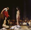
Gerome seems to have been one of those painters who paints the same thing - say, a Roman slave market - from several different angles, and at several different times. Here, for example, he has (with a bit of help from Bobinder and me) depicted the selling of @Barbaria1 and her travelling companion @Kathy . How did such nice girls come to such a juncture, eh? I suppose Barb can take comfort that the bidding seems to be lively. And now the girls won't have to worry about where to stay in Rome, and how much it might cost. It's nice to be popular.

Technical Notes:
The original concept (if that's not too lofty a term) for this image was the appearance in my archive of a series of images featuring Caprice, as well as a good sized version of Gerome's painting. The editing of the background was 14 layers to rebuild the crowd and the stage after cutting out the original figures. I floated the idea past Bob, and he got all inspired and did a full cutout and placement of the Kiera Winters (Kathy) image, which was better than my original concept. That sort of set the mood for the final piece. So in the end, this ends up being a joint manip with concept and ideas coming from both Bob and me. All rather fun.
Gerome seems to have been one of those painters who paints the same thing - say, a Roman slave market - from several different angles, and at several different times. Here, for example, he has (with a bit of help from Bobinder and me) depicted the selling of @Barbaria1 and her travelling companion @Kathy . How did such nice girls come to such a juncture, eh? I suppose Barb can take comfort that the bidding seems to be lively. And now the girls won't have to worry about where to stay in Rome, and how much it might cost. It's nice to be popular.


Technical Notes:
The original concept (if that's not too lofty a term) for this image was the appearance in my archive of a series of images featuring Caprice, as well as a good sized version of Gerome's painting. The editing of the background was 14 layers to rebuild the crowd and the stage after cutting out the original figures. I floated the idea past Bob, and he got all inspired and did a full cutout and placement of the Kiera Winters (Kathy) image, which was better than my original concept. That sort of set the mood for the final piece. So in the end, this ends up being a joint manip with concept and ideas coming from both Bob and me. All rather fun.
You just can't rattle @Kathy , can you? Barb looks a tad worried, but Kathy sits there completely nonchalantly without a care in the world!Barb and Kathy Move to Rome.
Gerome seems to have been one of those painters who paints the same thing - say, a Roman slave market - from several different angles, and at several different times. Here, for example, he has (with a bit of help from Bobinder and me) depicted the selling of @Barbaria1 and her travelling companion @Kathy . How did such nice girls come to such a juncture, eh? I suppose Barb can take comfort that the bidding seems to be lively. And now the girls won't have to worry about where to stay in Rome, and how much it might cost. It's nice to be popular.
View attachment 1016318
Technical Notes:
The original concept (if that's not too lofty a term) for this image was the appearance in my archive of a series of images featuring Caprice, as well as a good sized version of Gerome's painting. The editing of the background was 14 layers to rebuild the crowd and the stage after cutting out the original figures. I floated the idea past Bob, and he got all inspired and did a full cutout and placement of the Kiera Winters (Kathy) image, which was better than my original concept. That sort of set the mood for the final piece. So in the end, this ends up being a joint manip with concept and ideas coming from both Bob and me. All rather fun.
But in any case, this is a great image by Bobyrei, or Jollinder!

Last edited:
Well, the reason I look worried and Kathy looks smug is that I suspect Kathy will go for a higher price. It’s hard to compete with her when all the buyers have been informed that I refuse to swallow.You just can't rattle @Kathy , can you? Barb looks a tad worried, but Kathy sits there completely nonchalantly without a care in the world!
But in any case, this is a great image by Bobyrei, or Jollinder!
Seriously, Jolly. Nice work on this one. Five stars.


