• Sign up or login, and you'll have full access to opportunities of forum.

Original Manipulations by Cruxforums Members

Go to CruxDreams.com
You are absolutely right! Maybe I love the hegre girls in the first mail too much, but to my mind the second mail have a good balance between front, side and back. Please accept my apology!

And to say sorry to everyone I present a manipulation the great artist Damian made for me. We see a caravan of the typical traditional merchandise of Africa: salt (on the camels), gold (in the box) and slaves (on the ground).
Please visit his homepage damianartwork.com.
I suspect that most of the CF manip artists have used Hegre images in their work. As you noted, they are all very lovely. The only issue is, as Madiosi pointed out, that this thread is to be a type of gallery or showcase of members actual original manip work. We do welcome your contributions (very splendid desert backgrounds and some lovely models), but perhaps better placed in the resource threads noted by Madiosi.

Damian is always appreciated. :)
 
Great, thanks! Love the first picture (looks more realistic), the second is good, too. Could we see a whole coffle of this slaves in the desert? Maybe you like some pics from my desert collection...
This is the picture I made made, using the resources you uploaded. There are a lot of things I should fix up or redo, especially the feet, but this is what I have done at the moment. Since the models are so small against the background, I thought I could try different sizes.
Distant Shot.jpgClose up.jpgInbetween Shot.jpg
 
Last edited:
This is the picture I made made, using the resources you uploaded. There are a lot of things I should fix up or redo, especially the feet, but this is what I have done at the moment. Since the models are so small against the background, I thought I could try different sizes.
View attachment 1048219View attachment 1048205View attachment 1048218
Perfect picture, thanks! My favorite is the panoramic view, love the tension in the air. To my mind nothing has to be changed.

Please let us see more of this great art, I think it is a nice addition to the close up images.
 
This is the picture I made made, using the resources you uploaded. There are a lot of things I should fix up or redo, especially the feet, but this is what I have done at the moment. Since the models are so small against the background, I thought I could try different sizes.
View attachment 1048219View attachment 1048205View attachment 1048218
This is great work, Cran. Very nicely composed image of two North African traders taking their captured colonial maidens to the slave markets of Marrakech or somewhere. The girls have wonderfully suitable expressions. I always like it when the images used in a manip fit together so well. There are a number of things you can do with the feet, including simple replacement. You could do a colour replacement on the green bits so that they looked a bit more like they were walking on sand. That said, you might want to try something like a simple blur or even a slight erase on the feet. That might "fade" the feet into the sand a bit and make it look like the feet were sinking in a bit, which is what would naturally happen if a naked girl were to walk around in the Sahara (I suppose it happens - girls do live in the Sahara, for some unexplained reason). Some shadow work around the feet would also help make the girls look more like they belonged on the sand (I note that the trees and the camels have shadows that are not extremely dark, but they streak off to right). So what we have here is two guys on their camels, who have very sensibly waited until the evening, when the sun isn't beating down so hard, to walk their girls to market. The girls will arrive with a nice sheen of attractive persperation, but without being too dehydrated. :thumbsup: :thumbup:
 
Perfect picture, thanks! My favorite is the panoramic view, love the tension in the air. To my mind nothing has to be changed.

Please let us see more of this great art, I think it is a nice addition to the close up images.
Thank you Berater! I'm glad you like it.

This is great work, Cran. Very nicely composed image of two North African traders taking their captured colonial maidens to the slave markets of Marrakech or somewhere. The girls have wonderfully suitable expressions. I always like it when the images used in a manip fit together so well. There are a number of things you can do with the feet, including simple replacement. You could do a colour replacement on the green bits so that they looked a bit more like they were walking on sand. That said, you might want to try something like a simple blur or even a slight erase on the feet. That might "fade" the feet into the sand a bit and make it look like the feet were sinking in a bit, which is what would naturally happen if a naked girl were to walk around in the Sahara (I suppose it happens - girls do live in the Sahara, for some unexplained reason). Some shadow work around the feet would also help make the girls look more like they belonged on the sand (I note that the trees and the camels have shadows that are not extremely dark, but they streak off to right). So what we have here is two guys on their camels, who have very sensibly waited until the evening, when the sun isn't beating down so hard, to walk their girls to market. The girls will arrive with a nice sheen of attractive persperation, but without being too dehydrated. :thumbsup: :thumbup:
Thank you, Jollyrei!
I already did some colour replacment, using the Hue-Saturation window. I targeted specifically green, and shifted it to orange/brown, while bringing down the saturation. In the original picture, the green was a lot stronger. I wasn't confident that I properly cut around the shape of the feet, but I'm not as unceratin about it now as I was yesterday. I think maybe it looks okay, but I'm not sure.
I already added a slight ambient darker area underneath the girls, but adding more distinct shadows like with the trees and camels, as you pointed out, would be the thing for me to do.
I changed the levels in the girl to match the lighting and shadows of the picture, but I applied the changes univerally. I could have devided the girls into a left facing side, and a right facing side, to better get the angle of the sun.
I wasn't so sure about the direction of the chains or corresponding shadows, but now I think they fine, so I think I will leave them.
 
I thought you wanted them led alongside the camels, in which case a lot of these pictures, where the girls are walking towards the camera, will work for the first background you shared.
Hello Cran,

search my desert archiv and find more images, you could find them:


Hope they make a better fit!
 
Here is a manip I made. The background is Castle Kranichfeld, photographed by @Madiosi.
Castle Front.jpg
The model was posted to the Fitness Girls thread by @phlebas.
After the castle is captured, and the kingdom has fallen, the former Royal family is further disgraced, when the Princess is displayed naked from ontop of the castle. Her is cunt cleanly presented and spread out wide, to symbolize that she has been thoroughly conqured, along with her Kingdom, and is now a sexual trophy of the ruler of the new Kingdom.
 
The Scream
The Scream.jpg
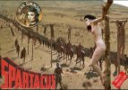
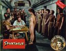
Inspired by an image from Spartacus presented by @sifax in his 'St Julia' thread.
The combination of the close-up profile and the blurred front aspect, both severely cropped, focus our attention on the spectacle of suffering in an intimate way.
The face and form almost tessellate in a dramatic composition. Great concept, Wragg! :)
 
The combination of the close-up profile and the blurred front aspect, both severely cropped, focus our attention on the spectacle of suffering in an intimate way.
The face and form almost tessellate in a dramatic composition. Great concept, Wragg! :)
Thanks Bob!, Sometimes you just see an image which makes the cogs start turning...
 
The Scream

View attachment 1055362

Inspired by an image from Spartacus presented by @sifax in his 'St Julia' thread.
I can see how this was inspiring for an image. It's extremely effective and captures the emotion and pain not only of the close up face, but by implication of the crucified girl in the background as well. We know exactly what has happened to the girl whose face is in the foreground now, and we see the raw emotion. Tremendous image, Wragg!!
And as you say, sometimes an image just jumps out at you and drives you to work with it. It's splendid that your vision was so well executed here.
:bdsm-heart::very_hot::clapping::clapping::clapping:
 
The Scream

View attachment 1055362

Inspired by an image from Spartacus presented by @sifax in his 'St Julia' thread.
The only thing with this (I thought) was that I spent time on the girl in the background and then had to blur her to achieve the depth of field effect. :(

So, here she is in the foreground with a CMCK girl replacing a thief on a cross in the background.

Wrists nailed to top.jpg
 
Kim finds herself with ominous prospects in the 'Field of the Damned', following an arduous three-hour crux session at the hands of @Baracus. The experience seems to have made something of an impression on her. Fedor Bronnikov's atmospheric painting dates from 1878 and hangs in Moscow's Tretyakov Gallery.

Bronnikov was a Russian artist who spent most of his career working in Italy. The painting depicts the execution ground outside Rome and it has become a regular performer, providing the background to a number of crux manips to date. I recall an earlier example by @hammers, but this is my first essay with the picture. :D

Kim B Fedor Bronnikov field damned exp1.jpg
 
Kim finds herself with ominous prospects in the 'Field of the Damned', following an arduous three-hour crux session at the hands of @Baracus. The experience seems to have made something of an impression on her. Fedor Bronnikov's atmospheric painting dates from 1878 and hangs in Moscow's Tretyakov Gallery.

Bronnikov was a Russian artist who spent most of his career working in Italy. The painting depicts the execution ground outside Rome and it has become a regular performer, providing the background to a number of crux manips to date. I recall an earlier example by @hammers, but this is my first essay with the picture. :D

I've certainly used the painting in at least one manip, although I think it was not the whole painting, but a crop. This is a very effective manip. Kim has almost finished removing her clothing, and seems unsure of what is in store for her, almost curious, more than terrified. It's a fascinating expression, given the setting, but it works to whet the viewer's imagination. A well chosen image of the model, coupled with your usual meticulous attention to lighting and colour blending. She fits into the background making us forget that it's a painting and not the backdrop of the photo. Beautiful work.
:thumbup::beer::clapping:
 
The Scream

View attachment 1055362

Inspired by an image from Spartacus presented by @sifax in his 'St Julia' thread.
This one is fantastic and evocative, I am in love with how you contextualized that scream, but I’d love to see got it looks with a more… suffering girl in the background.
 
You are right Wragg, those moments of interaction between the crucified and soon to be crucified are very special, a combination of intimacy and horror at the fate to come. However vulnerable and shamed the naked woman at the foot of the cross may feel, it is only the precursor to something far worse when she mounts that cross and is helplessly pinned and on display. Her tender acknowledgement of the already crucified victim is the only touch of humanity that she will receive, the only companionship a shared suffering beyond measure.
I love this description!
 
Kim finds herself with ominous prospects in the 'Field of the Damned', following an arduous three-hour crux session at the hands of @Baracus. The experience seems to have made something of an impression on her. Fedor Bronnikov's atmospheric painting dates from 1878 and hangs in Moscow's Tretyakov Gallery.

Bronnikov was a Russian artist who spent most of his career working in Italy. The painting depicts the execution ground outside Rome and it has become a regular performer, providing the background to a number of crux manips to date. I recall an earlier example by @hammers, but this is my first essay with the picture. :D

And an excellent essay it is, too!

It is hard to convincingly insert a photographed model into a painting, but you seem to have managed it very well!

This one is fantastic and evocative, I am in love with how you contextualized that scream, but I’d love to see got it looks with a more… suffering girl in the background.
More suffering... there's a challenge!
 
Back
Top Bottom