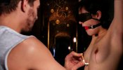
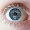
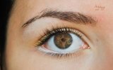
Watch her eyes.
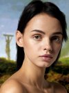
The scene is familiar and we guess at what her fate might be, but what does she see? Get closer.
Technical:
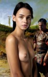
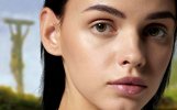
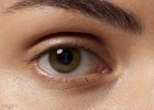
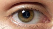
This is a progression of increasing detail and close-up versions of the same image.
None of the first 4 images is a blow up or increase in size from a smaller version. In fact, the first four images are crops or reductions from the original image.
The fourth image with Ariel’s eye is the actual original size of that detail.
The original image, when you look at the eye at actual size (fourth picture), means that at original size, the full image of Ariel here would be about 11 feet tall (and that’s just her from the waist up). That is not only impossible to upload, but impossible to work with on my machine. Photoshop crashed twice just loading the image and cropping the eye. You could cover a good sized wall with the original sized photo of Ariel .
The final (5th picture) close up of the eye is a magnification of the source. The second image (head and shoulders) is likely the closest to life-size.
However, with such a high-resolution eye at such a nice size, it is possible to play with optical illusions, so to speak, and I may have incorporated Alice into a manip in a way that hasn’t been done before.
Other than all of that, the image has four main elements. The background is a crop of Fyodor Bronnikov’s “Crucified Slaves” painting, which is a standard background for CF manips. The Roman is courtesy of some evangelical Jesus movie. The central model is Ariel-Lilit, who I have used several times before, from a photoshoot by Petter Hegre, and is an ultra-high-resolution shot. The Alice image was cut out and prepared separately before being placed into Ariel's eye at about 60% opacity and in black and white. There are no other main layers.
Because of the size of the images, all elements had to be incorporated “as is” into the final manip, which meant editing each element separately before assembling the collage. At that point, the image could be reduced to workable size to apply carefully logged colour, light, and contrast adjustments. I would note that once these were chosen for the main image, each successive image in the progression was cut from the original larger version to ensure that there was no loss of resolution or image detail. These successive sub-portraits were then adjusted in exactly the same way as the “full” image, so that these images form a true progression of details of the exact same image (with the exception of the fifth image).
The fifth image, close up of Ariel’s eye, was produced as an afterthought after chatting about it with Bobinder and Wragg. This is to accommodate people viewing on their tablets or phones, and is actually a “blow up” of the original source eye. Because of the sheer amount of original “data” and the fact that Photoshop is extremely good at using and extrapolating that data, there is almost no perceptible loss of image integrity.
I have learned that you do not really need to work with images quite this large.

The scene is familiar and we guess at what her fate might be, but what does she see? Get closer.


Technical:
This is a progression of increasing detail and close-up versions of the same image.
None of the first 4 images is a blow up or increase in size from a smaller version. In fact, the first four images are crops or reductions from the original image.
The fourth image with Ariel’s eye is the actual original size of that detail.
The original image, when you look at the eye at actual size (fourth picture), means that at original size, the full image of Ariel here would be about 11 feet tall (and that’s just her from the waist up). That is not only impossible to upload, but impossible to work with on my machine. Photoshop crashed twice just loading the image and cropping the eye. You could cover a good sized wall with the original sized photo of Ariel .
The final (5th picture) close up of the eye is a magnification of the source. The second image (head and shoulders) is likely the closest to life-size.
However, with such a high-resolution eye at such a nice size, it is possible to play with optical illusions, so to speak, and I may have incorporated Alice into a manip in a way that hasn’t been done before.
Other than all of that, the image has four main elements. The background is a crop of Fyodor Bronnikov’s “Crucified Slaves” painting, which is a standard background for CF manips. The Roman is courtesy of some evangelical Jesus movie. The central model is Ariel-Lilit, who I have used several times before, from a photoshoot by Petter Hegre, and is an ultra-high-resolution shot. The Alice image was cut out and prepared separately before being placed into Ariel's eye at about 60% opacity and in black and white. There are no other main layers.
Because of the size of the images, all elements had to be incorporated “as is” into the final manip, which meant editing each element separately before assembling the collage. At that point, the image could be reduced to workable size to apply carefully logged colour, light, and contrast adjustments. I would note that once these were chosen for the main image, each successive image in the progression was cut from the original larger version to ensure that there was no loss of resolution or image detail. These successive sub-portraits were then adjusted in exactly the same way as the “full” image, so that these images form a true progression of details of the exact same image (with the exception of the fifth image).
The fifth image, close up of Ariel’s eye, was produced as an afterthought after chatting about it with Bobinder and Wragg. This is to accommodate people viewing on their tablets or phones, and is actually a “blow up” of the original source eye. Because of the sheer amount of original “data” and the fact that Photoshop is extremely good at using and extrapolating that data, there is almost no perceptible loss of image integrity.
I have learned that you do not really need to work with images quite this large.


