• Sign up or login, and you'll have full access to opportunities of forum.

Original Manipulations by Cruxforums Members

Go to CruxDreams.com
This is a manip I made. The picture was posted by @thehangingtree in Nude Out of Place and I got the assets from the Manip Contruction Kit. I'm suprised how well they fit.
I thought that she was dressed inappropriatly to be seen in public, so I fixed it so that she will be dressed more appropriately.
I added shadows, but I think maybe they look a bit artificial. I wasn't sure if they actually improve the picture, so I also uploaded the picture withouth them. I made the shadows on their own layer, so I was able to get rid of them by making that layer invisible.

With shadows:
View attachment 973364

Without shadows:
View attachment 973365
That woman has no shame! now just look at her (hosted externally)
kvC2wEb.jpg

There she is quite openly walking along with...TWO plastic carrier bags. I'm reporting the bloody woman to Greta Thunderthighs!
 
This slave is never allowed off the premises unsupervised. When she is not performing any duties, she is locked into this yard, to keep her out of the house, and out of the way. This is considered her free time.
The yard is completally empty, and devoid of any objects or furniture. For her recreation, she can run circles around the yard for exercise, and if she is too tired, she can always sit or lie down on the grass. However, the yard does not provide her with any shade, as she shouldn't be to privilaged, so during this time she is constantly in direct sunlight, naked. She can be here, hours at a time, depending on if she is naked.
For a slave, this should be comfortable for her, and enough to keep her occupied, and most slaves wouldn't even be given this free time, or such a large space for themselves. However, as a woman who was only recently enslaved, she is not thrilled that this is how she is the spend the rest of her free time, when she isn't allowed into the house to do chores.

View attachment 974977
Sounds ideal. However, some shackles may be needed,
 
Unfortunately I cannot open this....maybe because I am using a Linix OS???
No I do not think so. I use Linux Mint and the Firefox browser opens the PDF file with ease.
 
However, the tan lines show that she couldn't have been a slave for that long.
she probably usually has to wear a chastity belt, and some sort of ornamental nipple-grips on those titties!
she's grinning as it's her one day out completely bare.
 
she probably usually has to wear a chastity belt, and some sort of ornamental nipple-grips on those titties!
she's grinning as it's her one day out completely bare.
She learned to identify as naked slave to be put on display, so is disappointed that parts of her are covered up when she is in public. When completely naked like this, she feels that she is fufilling more of her true purpose.
Her tits do call for some form of ornimentations.
 
I don't know if it's okay if I post unfinished work like this. I spent a lot of time on this already, and I feel like posting something at the moment.
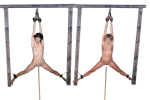
I used pictures that @Ovid posted in his Inverse Y thread, and I used the perspective tool to make them fit into the same photograph. Although I didn't think that would be perfect, I thought it would work well enough if done subtly. I needed to use different frames, as the ones in the photographs were cropped. I used a gallows that @Madiosi posted in the Construction Kit.
I didn't correct the colour/contrast yet, as I didn't find a background I want to use. I was thinking of leaving them out in the open, in some barren landscape.
They are being penetrated by a macine, that is pumping the poles up and down.
I want them to be raised on a platforms, with the poles poking out in gaps inbetween. I might reporpose the platform off the gallows for that.

WIP.png
 
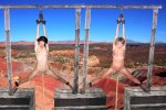
I added a background, and raised them on platforms.
For the platforms, I used the platform from the gallows in the Contstruction Kit. I cut it into different front and up facing surfaces, and used the persepective tool on each one individually. They've gotten very blurred, I think because I scaled them down, to roughly the size I want, and then stretched them to match the proportions. I used already used blurred pictures for the women anyway. I would have had to apply a blur filter to make them match, but that saved me the effort. ;)
I thought I did an okay job when I was correcting contrast so that everything matches the sunny conditions, but I'm not so sure how it looks now. I think I might have also left to much of a border, when I was cutting out the women, as there seem to be a slight shadow around them. I don't know what the shadow running across the platform can represent. I did fix the seems inbetween the surfaces of the platforms, but I also did a lot of backtracking while working on this, and I might have undone them without relizing. It was also hard to find a landscape that match the eye level, as I did the perspective on the women/frames first, but fortunatly, they don't have to align with the ground because they are on platforms.
There is still work that can be done on this, but for the moment I will consider it finished.

Enjoying the Scenic View.jpg
 
I added a background, and raised them on platforms.
For the platforms, I used the platform from the gallows in the Contstruction Kit. I cut it into different front and up facing surfaces, and used the persepective tool on each one individually. They've gotten very blurred, I think because I scaled them down, to roughly the size I want, and then stretched them to match the proportions. I used already used blurred pictures for the women anyway. I would have had to apply a blur filter to make them match, but that saved me the effort. ;)
I thought I did an okay job when I was correcting contrast so that everything matches the sunny conditions, but I'm not so sure how it looks now. I think I might have also left to much of a border, when I was cutting out the women, as there seem to be a slight shadow around them. I don't know what the shadow running across the platform can represent. I did fix the seems inbetween the surfaces of the platforms, but I also did a lot of backtracking while working on this, and I might have undone them without relizing. It was also hard to find a landscape that match the eye level, as I did the perspective on the women/frames first, but fortunatly, they don't have to align with the ground because they are on platforms.
There is still work that can be done on this, but for the moment I will consider it finished.

View attachment 976345
I think it's pretty good - certainly dramatic, and an unusual version of the 'spread for impaling' scenario. Perhaps the background's a bit 'busy', but the colours complement the victims' skins well. Others are better qualified than I am to assess the technical aspects, but I'm impressed.
 
I think it's pretty good - certainly dramatic, and an unusual version of the 'spread for impaling' scenario. Perhaps the background's a bit 'busy', but the colours complement the victims' skins well. Others are better qualified than I am to assess the technical aspects, but I'm impressed.
Thank you Eulalia!
I had the idea that they should be held up high, so that they can be seen all around. Also, the only landscapes that I could find that are photographed looking down, the angle at which the women are, was of expansive landscapes like this. Most of the ones I could find, either outdoors or in dungeons, were looking straight a head.
 
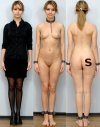
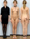
I already posted pictures with this theme, but this picture which @dfg42 posted in his Dressed/Undressed/Crucifixion seemed like a very good example for it. Despite the request of that thread, it is a lot easier to put a collar and manacles on her, than to crucify her. I put a brand on her, as I thought the back shot should have its own reveal, being the third stage. Can anyone offer any advice on branding?
I would also prefer if the clothed shot of her was in a more casual setting, so we see her transition from her everyday life, to a slave linup.
Also, can't help that she seems to have a slight smile, that actually increases slightly when she goes from being clothed to nude, or to being enslaved.

Slave Linup2.jpg
 
I already posted pictures with this theme, but this picture which @dfg42 posted in his Dressed/Undressed/Crucifixion seemed like a very good example for it. Despite the request of that thread, it is a lot easier to put a collar and manacles on her, than to crucify her. I put a brand on her, as I thought the back shot should have its own reveal, being the third stage. Can anyone offer any advice on branding?
I would also prefer if the clothed shot of her was in a more casual setting, so we see her transition from her everyday life, to a slave linup.
Also, can't help that she seems to have a slight smile, that actually increases slightly when she goes from being clothed to nude, or to being enslaved.

View attachment 977067
actually I used this site lot for crux manips. Background is whie and usually there is a sitting position which is useful

 
Can anyone offer any advice on branding?
Before and after contrasts are always interesting to see, and you have become an expert in the detailed art of fitting manacles and shackles. As for the brand, the letter 'S' appears to have been added using the 'Type' tool, and is quite sharply defined. If you are unable to use the blurring tools and filters directly on typed lettering, perhaps you can reduce the opacity of that layer, or experiment with different treatments on a copied/duplicated layer?

We have previously discussed making opacity adjustments as a fine tuning technique for shadows, but it can be applied to any layer which requires a softening treatment. My last manipulation is composed of thirteen visible layers, nine of which are at reduced opacity. ;)
I thought of a brand as being very solid, like a patch of burnt flesh, so a made it strong with sharp outlines, but your suggestions make it look more like an actual brand.
This is it following you suggestions
Slave Linup4.jpg

In my previous post, I also tried to apply a texture to the brand, charred wood which I coloured to a dark red. Before that, I attempted the brand as a solid colour, which I saved on it's own layer, as I used it as a mask for cutting out the texture.
For your suggestions, I used the solid colour, because now I don't think the brand should have a texture like that.
 
Back
Top Bottom