Cran
Governor
If only every girl can be like you, Eulalia.And why not?

If only every girl can be like you, Eulalia.And why not?
Well, depending on your software, yes you can, but that's another transformation warp issue.Also, can't help that she seems to have a slight smile, that actually increases slightly when she goes from being clothed to nude, or to being enslaved.

I was worried that I can mess that up.Well, depending on your software, yes you can, but that's another transformation warp issue.
Of course you can. So can I. So can Bobinder. We can all mess things up, and I think we probably do so frequently. That's what multiple save files are for.I was worried that I can mess that up.

Also, can't help that she seems to have a slight smile, that actually increases slightly when she goes from being clothed to nude, or to being enslaved.
View attachment 977067
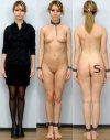 Minimal reworked for a bit sadness in her face. I used PaintShopPro 18 - deformation tool (Mouth) - smudge tool (Eyes).
I was too hesitant to try and make changes to the face. But it looks really good when you done it.View attachment 977469 Minimal reworked for a bit sadness in her face. I used PaintShopPro 18 - deformation tool (Mouth) - smudge tool (Eyes).
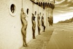
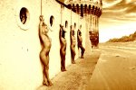
Very nice work. The sepia effect is excellent. I'm not entirely sure that the wall with round windows fits with the architectural style of the castle tower, but that's not particularly important. You have blended the women in quite nicely and the whole thing has a good feel of a unified picture. I don't think the cropping it too sharp, but a little blur around the edges, as you did in the second image, is probably all you need if you don't like the hard edges.I used a picture with very strong bondage connotations. Although, there is no actual bondage in it itself. The women conform to a pose. But, they are not tied up. The original picture of the women was in black and white, it isn't an artistic choice on my part, but I did add a brown tint to make it look more deserty.
After the city is taken, all the men are killed, their women are stripped naked and are demonstrated outside the castle walls, to signigy the defeat of the enemy. After a couple of nights, they will eventually be taken back in, where they will serve as slaves.
The castle wall I put in the background was a lot longer, but I cropped it, as the original picture it is taken from included trees, making the turret look like the corner. and is positioned so other trees that appear in the picture, will be blocked by the wall in the forground. I wasn't sure if the trees could be passed as desert vegitaion.
It was taken from a lower resolution picture, than the rest, and I couldn't help, when it looked blurred when I scaled it up. Sharpening it only made the shadows too strong.
Unlike my previous manips, I didn't use feathered edges when using the free select tool, as I thought the edges in my inverse Y manip were too fuzzy, but maybe I should have just used them on a lower setting. Does this look better, or is the cropping too sharp?
I don't think I have done as good a job cropping out the top of the wall, as it is hard to tell what is part of it, and what is artifacting.
I put some work into trying to shade the rope, but I'm not sure if I still got them to match.
View attachment 977683
I didn't crop, or blend in the women. They were already leaning against the wall in that pose, I just took advantage of it. The manip I did is a lot less impressive than that. They looked as if they should have been tied up, but they weren't.Very nice work. The sepia effect is excellent. I'm not entirely sure that the wall with round windows fits with the architectural style of the castle tower, but that's not particularly important. You have blended the women in quite nicely and the whole thing has a good feel of a unified picture. I don't think the cropping it too sharp, but a little blur around the edges, as you did in the second image, is probably all you need if you don't like the hard edges.
I'm less convinced by your second and third images on this one. As Eul says, it seems to be getting hotter, but I personally prefer things a bit less glaring. If you need to blend elements you could do a "blur" filter set on average colour of the background image, and set that to about 10-13% opacity, and you'd probably get what you want.
Apart from the technical details, it all comes down to "do we like the image" and I do very much. It suggests a story and there is a nice ominous sky to help build the ambience.
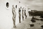
No, not necessarily. It's nice to see it, but you have done a very skillful job with the ropes. They look entirely "at home" in your image, and the castle and wilderness backgrounds you used turned it into a really nice foreboding and surreal image. It's often not how many elements you put in, but what you do with what you've got. Don't sell yourself short on this one.I probably should have included the original picture.

Thank you, Jollyrei!No, not necessarily. It's nice to see it, but you have done a very skillful job with the ropes. They look entirely "at home" in your image, and the castle and wilderness backgrounds you used turned it into a really nice foreboding and surreal image. It's often not how many elements you put in, but what you do with what you've got. Don't sell yourself short on this one.
A nice thick, long sausage, a pair of warm, throbbing eggs ... what does that remind me of?This is another basic manip, but I thought that she looked so good, performing her kitchen chores completally naked, with her downcast withdrawn expression, that it was a shame that she isn't collared. I don't know if I did as good a job bledning in her right wrist cuff.
View attachment 980357
And I was focused on the reflection of the coffee pot in the counter top.A nice thick, long sausage, a pair of warm, throbbing eggs ... what does that remind me of?


If you can't remember, it's probably not important.A nice thick, long sausage, a pair of warm, throbbing eggs ... what does that remind me of?


