• Sign up or login, and you'll have full access to opportunities of forum.

Original Manipulations by Cruxforums Members

Go to CruxDreams.com
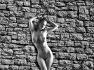
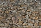
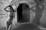
I added a brick background. Although it dosn't seem like much of a development from my previous post, I couldn't think of any other details that I could add.
Unfortunatly, that was the best brick background that I could find, without having to sign up to a website, and the resolution was quite low, especially when I had to scale it up. I was thinking of downscaling the entire picture, but I would have had to make it very low res to match the background, so I chose not to.
Are there any critisisms or feedback you can provide?
Chain2.jpg
 
I added a brick background. Although it dosn't seem like much of a development from my previous post, I couldn't think of any other details that I could add.
Unfortunatly, that was the best brick background that I could find, without having to sign up to a website, and the resolution was quite low, especially when I had to scale it up. I was thinking of downscaling the entire picture, but I would have had to make it very low res to match the background, so I chose not to.
Are there any critisisms or feedback you can provide?
View attachment 1035464
It does add some nice contrast, as well as context for the picture. Right away, it's not just a girl with chains, but a girl with chains in a particular spot, which makes the imagination work a bit more. Nice work. :)

The sourcing of backgrounds for manips is always an issue. Some people use original photographs. You can also just search images on the internet, but it's a process to find something really good. You'll notice that many of the manip artists use paintings, or other images as backgrounds or context elements. There are also some threads here at CF that have backgrounds available for use - check the CMCK manipulations construction kit, for example.
Thank you Jollyrei.
I was thinking of the wall of a tolbooth, like in Eulalia's story, but the ambiguity of the manip allows observer to project her into any setting. There are a few plants to her left, which I didn't want, but were part of the background picture. I got the collar and shackles from the Construction Kit thread, but I didn't search it for a background.
 
I added a brick background. Although it dosn't seem like much of a development from my previous post, I couldn't think of any other details that I could add.
Unfortunatly, that was the best brick background that I could find, without having to sign up to a website, and the resolution was quite low, especially when I had to scale it up. I was thinking of downscaling the entire picture, but I would have had to make it very low res to match the background, so I chose not to.
Are there any critisisms or feedback you can provide?
View attachment 1035464
I like it, Cran. The lighting is nice and consistent across both the model and the background, and I don't think the low resolution background detracts from te overall effect at all.
 
I added a brick background. Although it dosn't seem like much of a development from my previous post, I couldn't think of any other details that I could add.
Unfortunatly, that was the best brick background that I could find, without having to sign up to a website, and the resolution was quite low, especially when I had to scale it up. I was thinking of downscaling the entire picture, but I would have had to make it very low res to match the background, so I chose not to.
Are there any critisisms or feedback you can provide?
Chain2.jpg
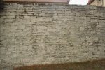
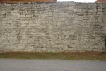
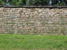
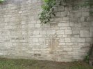
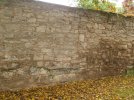
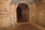
A Google search will usually produce something suitable. This backgound is fairly hi-res and can be desaturated for a monochrome subject. It appears to be lit by sunlight, but the relative contrast can be reduced. I note that your current background has very high contrast, which is distracting attention from the figure. I think it may be worth experimenting with reduced contrast. I hope this helps.

8-727_stone_wall_web.jpg

We have at least one thread dedicated to background images, which might be useful -
 
A Google search will usually produce something suitable. This backgound is fairly hi-res and can be desaturated for a monochrome subject. It appears to be lit by sunlight, but the relative contrast can be reduced. I note that your current background has very high contrast, which is distracting attention from the figure. I think it may be worth experimenting with reduced contrast. I hope this helps.


We have at least one thread dedicated to background images, which might be useful -
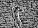
I followed your advice, but I also noticed that the shadows were too strong in the model, so I changed the gamma, to better match broad daylight.
Chain3.jpg
The original backround was very bright, but the model had strong shadows. In the previous post, I tried to get the to background match the model, by lowering the white output, but also lowering the gamma, so I muted the overall brightness while also darkening the shadows. I still didn't think that the background suited the model, so I also increased the contrast of the model, but I think I made the shadows too distinct, so it looked more like sunset rather than midday.
Here, I further lowered the brightness of the background, but also decreased the shadows, and I increased the gamma in the model, so the lighting would seem less direct.
 
I added a brick background. Although it dosn't seem like much of a development from my previous post, I couldn't think of any other details that I could add.
Unfortunatly, that was the best brick background that I could find, without having to sign up to a website, and the resolution was quite low, especially when I had to scale it up. I was thinking of downscaling the entire picture, but I would have had to make it very low res to match the background, so I chose not to.
Are there any critisisms or feedback you can provide?
View attachment 1035464
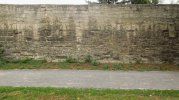
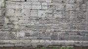
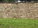
2018-0910-163902.jpg2018-0910-163916.jpg2018-0910-164112.jpg2018-0405-115302.jpg2017-0705-150024-1.jpg

2017-0705-150232.jpg2017-0705-154016.jpg2016-0927-171810.jpg2016-1021-113142.jpg2016-0927-155116.jpg
 
I followed your advice, but I also noticed that the shadows were too strong in the model, so I changed the gamma, to better match broad daylight.
View attachment 1036088
The original backround was very bright, but the model had strong shadows. In the previous post, I tried to get the to background match the model, by lowering the white output, but also lowering the gamma, so I muted the overall brightness while also darkening the shadows. I still didn't think that the background suited the model, so I also increased the contrast of the model, but I think I made the shadows too distinct, so it looked more like sunset rather than midday.
Here, I further lowered the brightness of the background, but also decreased the shadows, and I increased the gamma in the model, so the lighting would seem less direct.
2016-0927-155116.jpgMadiosi-2021-085-basement.jpg
https://www.cruxforums.com/xf/attachments/2016-0927-155116-jpg.1036267/
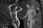
Example of possibilities with the components.
 
And to celebrate the solution of the "we can't post pictures" problem, I am pleased to release my latest orientalist manip, riffing off a painting by Otto Pilny.
The Sheik had come a long way from his home and was ready for some relaxation in the city. He had heard that there were lovely infidel girls on sale, and he had hoped to find something to enhance his own harem. The old trader looked dodgy, but spoke in educated tones, and insisted he had what the Sheik was looking for. The Sheik was tired and welcomed a chance to sit down. He rolled a cigarette and prepared to see what the old man had to offer. He was not disappointed.

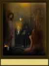
Slave Market at Sunset
View attachment 1034821
Good pic , Really clean lines nice theme ... how do you get them so clear ?
 
Good pic , Really clean lines nice theme ... how do you get them so clear ?
Thanks for the comment. :) As to the clarity of focus, that is due to several factors. The first is that I try to start with as high a resolution background image as possible. Enlarging a small image will usually reduce focus, so start with something large. I also try to use larger images of the models. Both girls in this picture started out in photos that were larger than 1680x1050 pixels. I make my own "cutouts" of the models using a masking technique that allows me to paint in or paint out the background, and then use that layer mask to eliminate the background of the original photo (make it transparent). I also am fairly meticulous about going around the edges and using a very fine "blur" effect to get a clean but soft edge to the model's image. This helps with the illusion that they belong in the new picture. But what this really achieves is that if I have made a mistake and either left in a rough edge, or cut too much of the figure away, I can simply paint it back in again from the original image, which I could not do if I just used the "erase" tool. Credit to Bobinder for doing a lot of work on this method and then very patiently explaining it to me. :D

In this case, the background painting was clean enough that the girls could be inserted without too much filtering or retouching to make them look like they belong in a painting. But for a really nice image, start with as large a photo of your model as you can find. It's really hard to get a great result if you have a 4000x3000 background picture, and you're trying to plug in a tiny 600x300 pixel girl. It's hard to keep her from being blurry when you enlarge her.
Most I use are large pics and I do smooth after I insert the model . I find I have to enlarge the background on some ... . I do use smaller models at times then clean them up . Thanks .
 
Back
Top Bottom