-
Sign up or login, and you'll have full access to opportunities of forum.
You are using an out of date browser. It may not display this or other websites correctly.
You should upgrade or use an alternative browser.
You should upgrade or use an alternative browser.
Original Manipulations by Cruxforums Members
- Thread starter Wragg
- Start date

Beautiful! Beyond this being a picture of a strikingly lovely girl, her pose and expression are poignantly perfect.
 The setting is convincing and the whole composition with the chain and her scant clothing give a sense of foreboding or anticipation. Is she simply being sold? Is she newly arrived at a new home and wondering what her life will be like? Is she a recaptured slave awaiting some judgement? Whatever it is, she is a sympathetic character. Technically the lighting and colouring are all perfectly blended to give us what looks like a mid-2nd century photograph, but it must have been done by a painter of some skill, since cameras were not invented yet.
 Have I mentioned that this is a beautiful image?


Well, now, I was reading through @Praefectus Praetorio's 'A Slave's Love Notes' when I was completely poleaxed by the image that he posted under the heading 'Irons for the slavegirl':
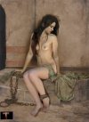
Being of that kind of mind, I wondered if I could incorporate @E-DigitalFantasy's wonderful Lily into the image.
So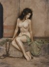 +
+  +
+  =
= 
Who said math(s) isn't fun?
A Slave's Love Notes
“Go Stand in the Corner” Most every little girl and boy has experienced that command and punishment. However, only a lucky few big girls have had the experience. It has, of course, adult refinements. First and most important, you must be naked or nearly naked in the corner. Punished, banished...
www.cruxforums.com
Being of that kind of mind, I wondered if I could incorporate @E-DigitalFantasy's wonderful Lily into the image.
So
 +
+  +
+  =
= 
Who said math(s) isn't fun?

E-DigitalFantasy
Tribune
Yes Wragg. Please do! I would be honored and I am eager in anticipation of seeing the results of your wonderful talent and your gift to us! Thank you!Well, now, I was reading through @Praefectus Praetorio's 'A Slave's Love Notes' when I was completely poleaxed by the image that he posted under the heading 'Irons for the slavegirl':
A Slave's Love Notes
“Go Stand in the Corner” Most every little girl and boy has experienced that command and punishment. However, only a lucky few big girls have had the experience. It has, of course, adult refinements. First and most important, you must be naked or nearly naked in the corner. Punished, banished...www.cruxforums.com
Being of that kind of mind, I wondered if I could incorporate @E-DigitalFantasy's wonderful Lily into the image.
So View attachment 1043555 + View attachment 1043557 + View attachment 1043556 = View attachment 1043558
Who said math(s) isn't fun?
Well, now, I was reading through @Praefectus Praetorio's 'A Slave's Love Notes' when I was completely poleaxed by the image that he posted under the heading 'Irons for the slavegirl':
A Slave's Love Notes
“Go Stand in the Corner” Most every little girl and boy has experienced that command and punishment. However, only a lucky few big girls have had the experience. It has, of course, adult refinements. First and most important, you must be naked or nearly naked in the corner. Punished, banished...www.cruxforums.com
Being of that kind of mind, I wondered if I could incorporate @E-DigitalFantasy's wonderful Lily into the image.
So View attachment 1043555 + View attachment 1043557 + View attachment 1043556 = View attachment 1043558
Who said math(s) isn't fun?
Nicely done Wragg, really nice piece of work. Thanks for the extra pictures showing the materials and the before and after shots, I remember being inspired by a similar sequence on Arcimboldo's old site years ago, it can be very encouraging to beginners to see how things can be put together.
Cran
Governor
This is what I've done so far.

I resorted to using a low res background I found, and the platform she is standing on is also lower res than I would like. I imagine that she would be standing in front of an audience, but I didn't impliment one yet. I don't know how I would do it, other than pasting in a lot of individuals.

I resorted to using a low res background I found, and the platform she is standing on is also lower res than I would like. I imagine that she would be standing in front of an audience, but I didn't impliment one yet. I don't know how I would do it, other than pasting in a lot of individuals.
Fossy
SEXPIOGENTUS
Her facial expression, the submissive angle of her head, the chained helplessness if her situation ... so very, very hot. Excellent work...This is what I've done so far.
View attachment 1044675
I resorted to using a low res background I found, and the platform she is standing on is also lower res than I would like. I imagine that she would be standing in front of an audience, but I didn't impliment one yet. I don't know how I would do it, other than pasting in a lot of individuals.
Though you are correct in that a crowd would be ideal ... and add significantly to her overall humiliation
It is good to see Lily featuring in such an attractive manipulation, especially since she was largely overlooked by manip artists for so long, despite the wealth of available source material. Curiously, William Mortensen's 'Slave Girl' picture reminded me of Lily when I first saw it, so Wragg's choice of model for his latest manip does not seem very surprising. Indeed, he has produced a wonderful synthesis of the sources by Mortensen and @E-DigitalFantasy , the result being a sympathetic blend of components in a composite figure.
Whilst Mortensen trained as an artist, he made his name as a Hollywood photographer. His 'Slave Girl' is entirely in the style of orientalist slave market paintings from the nineteenth century, although it dates from 1959 and is a relatively late work. What is not immediately obvious is that the picture is a photograph, composed and developed to emulate a painting.
During the 1920s and 1930s, when the surrealists were experimenting with photography, Mortensen developed a reputation for innovative photo manipulation, creating scenes inspired by horror films and old master paintings. His subjects include witches, demons and dancers. Ansell Adams called him the 'Anti-Christ of Photography' but maintained a respectful open correspondence with him via the letters pages of periodicals.
It is entirely appropriate that the work of this pioneer photo manipulator should be re-worked as a new manipulation by one of our fantasy artists, and Mortensen would surely approve, even though he would be amazed by the digital techniques involved. Lily's pose approximates that of the original figure, and the two are carefully blended, retaining the original arms and hair. The drapery and fetters have been adjusted and relocated, preserving the look of Mortensen's picture. Beautiful work, Wragg - thanks for indicating all of the sources.

Several of Mortensen's pictures have been presented on CF in the past. The following links provide a selection of his fantasy images and a short monograph by Wikipedia -

William Mortensen, the Antichrist of photography
“L’Amour,” probably William Mortensen’s most famous image It’s not many photographers whose works can withstand comparison to Rembrandt and Vermeer, but if there is one, then William Mortensen is that photographer. Debates about the “status” of photography as both neutral recorder of reality...
William Mortensen - Wikipedia
 en.wikipedia.org
The lo-res background is not a problem, and it could be defocused further to imply a sense of distance.
The platform is obviously closer to the viewer, and it helps to define the foreground.
As you observe, pasting in members of the audience would be the way to populate the scene. Nice work.

Thanks Bob! Now I know about William Mortensen!It is good to see Lily featuring in such an attractive manipulation, especially since she was largely overlooked by manip artists for so long, despite the wealth of available source material. Curiously, William Mortensen's 'Slave Girl' picture reminded me of Lily when I first saw it, so Wragg's choice of model for his latest manip does not seem very surprising. Indeed, he has produced a wonderful synthesis of the sources by Mortensen and @E-DigitalFantasy , the result being a sympathetic blend of components in a composite figure.
Whilst Mortensen trained as an artist, he made his name as a Hollywood photographer. His 'Slave Girl' is entirely in the style of orientalist slave market paintings from the nineteenth century, although it dates from 1959 and is a relatively late work. What is not immediately obvious is that the picture is a photograph, composed and developed to emulate a painting.
During the 1920s and 1930s, when the surrealists were experimenting with photography, Mortensen developed a reputation for innovative photo manipulation, creating scenes inspired by horror films and old master paintings. His subjects include witches, demons and dancers. Ansell Adams called him the 'Anti-Christ of Photography' but maintained a respectful open correspondence with him via the letters pages of periodicals.
It is entirely appropriate that the work of this pioneer photo manipulator should be re-worked as a new manipulation by one of our fantasy artists, and Mortensen would surely approve, even though he would be amazed by the digital techniques involved. Lily's pose approximates that of the original figure, and the two are carefully blended, retaining the original arms and hair. The drapery and fetters have been adjusted and relocated, preserving the look of Mortensen's picture. Beautiful work, Wragg - thanks for indicating all of the sources.
Several of Mortensen's pictures have been presented on CF in the past. The following links provide a selection of his fantasy images and a short monograph by Wikipedia -

William Mortensen, the Antichrist of photography
“L’Amour,” probably William Mortensen’s most famous image It’s not many photographers whose works can withstand comparison to Rembrandt and Vermeer, but if there is one, then William Mortensen is that photographer. Debates about the “status” of photography as both neutral recorder of reality...dangerousminds.net
William Mortensen - Wikipedia
en.wikipedia.org
mp5stab
Hair and Nails
Like bobnearled said, you can blur the background much more to give a soft focus effect to the foreground subject. Additionally you can desaturate the background a little too bring the foreground in tighter. This is great work!This is what I've done so far.
View attachment 1044675
I resorted to using a low res background I found, and the platform she is standing on is also lower res than I would like. I imagine that she would be standing in front of an audience, but I didn't impliment one yet. I don't know how I would do it, other than pasting in a lot of individuals.
Following a discussion about the relative merits of denim shorts being worn by crux models, I made this illustration to the poem, 'Denim Shorts' by @Eulalia which appears here -
Only on posting the first manipulation did I realise that Eul's poem was originally published exactly ten years previously. And so, the picture is presented as a tenth anniversary celebration. The requisite, blue denim shorts have been added as a separate component.
Four layers account for the progressively defocused background (by Philippe Claes) and eight layers for the figure of Courtney, each with its own colour blending filter. The lighting is ambiguous since the studio pose has at least two flood and flash light sources. The camera was level with Courtney's waist, so ideally, that is where the eye level and horizon of the background should appear.
I love the humorous image in which Courtney drops her panties during the session by Henry Choi. He gave it the title, 'Ta-dah', which seems to be the fanfare announcing her exposure. Despite the sense of fun, the purple and pink bra and panties did not compliment the blue and beige tones of the new coastal scene, so I decided to delete them. The feet were repainted using the Photoshop brushes and colour picker. The breasts are from another picture of Courtney, taken during the same session. Selective colour and brightness adjustments ensure that they blend in convincingly, so her appearance remains authentic.
Fit, Lovely Ladies Crucified
Maybe he just has a thing for leggy girls in white denim shorts. They look great on her, though I admit many here would rather see them (and the rest of her clothes) crumpled up on the ground in front of her cross.
www.cruxforums.com
Only on posting the first manipulation did I realise that Eul's poem was originally published exactly ten years previously. And so, the picture is presented as a tenth anniversary celebration. The requisite, blue denim shorts have been added as a separate component.
Four layers account for the progressively defocused background (by Philippe Claes) and eight layers for the figure of Courtney, each with its own colour blending filter. The lighting is ambiguous since the studio pose has at least two flood and flash light sources. The camera was level with Courtney's waist, so ideally, that is where the eye level and horizon of the background should appear.
I love the humorous image in which Courtney drops her panties during the session by Henry Choi. He gave it the title, 'Ta-dah', which seems to be the fanfare announcing her exposure. Despite the sense of fun, the purple and pink bra and panties did not compliment the blue and beige tones of the new coastal scene, so I decided to delete them. The feet were repainted using the Photoshop brushes and colour picker. The breasts are from another picture of Courtney, taken during the same session. Selective colour and brightness adjustments ensure that they blend in convincingly, so her appearance remains authentic.

Cran
Governor
I didn't include an crowd, but I put effort into making her look more sunbeaten. I spent a lot of time on this, as I was never sure if it looked right. I think it looks okay now, but I had difficulties darkening her skin without resulting in strong shadows. I also wanted to give her a glossy sheen from sweat, but I had difficulties making it work, does anyone have any advice? I also tried to put her hair on a seperate layer, separating it from her skin with the Colour to Alpha toolso I wouldn't darken, so I won't darken it, but it didn't work as well against her skin as it did against the *mostly* solid background.
I also softened and disaturated the background a bit, as suggested by Bobinder and Hair and Nails, and I made the blur transition, rather than be constant for the entire background.

I also softened and disaturated the background a bit, as suggested by Bobinder and Hair and Nails, and I made the blur transition, rather than be constant for the entire background.

Last edited:
Very nice work. You may have overcompensated a bit on the shadows or contrast - tricky stuff, but we've lost the detail in her hair, which was nice. If you're using Photoshop, you might want to play with "Levels" on the layer with the girl, and just adjust in the mid-tones. Then you can saturate a bit of red in a colour mixer tool to get the sunburn light effect. Otherwise, the photo is now quite sharp and she does not look over-exposed, which is lovely. She is a beautiful model - great posture and a sweet resigned expression.I didn't include an crowd, but I put effort into making her look more sunbeaten. I spent a lot of time on this, as I was never sure if it looked right. I think it looks okay now, but I had difficulties darkening her skin without resulting in strong shadows. I also wanted to give her a glossy sheen from sweat, but I had difficulties making it work, does anyone have any advice?
I also softened and disaturated the background a bit, as suggested by Bobinder and Hair and Nails, and I made the blur transition, rather than be constant for the entire background.
View attachment 1045223
Cran
Governor
I just updated my previous post to mention that I did attempt to seperate the hair onto a separate layer, but it didn't work out using the Colour to Alpha tool. In my previous manipulations, I would manually crop around strands of hair, using feather edges, so that it would overlap with the collars, so maybe I could try that here, but I was hoping that I could use Colour to Alpha, since it works so well against solid backgrounds for individual and blurry hair strands. I prefer manual cropping for solid shapes.Very nice work. You may have overcompensated a bit on the shadows or contrast - tricky stuff, but we've lost the detail in her hair, which was nice. If you're using Photoshop, you might want to play with "Levels" on the layer with the girl, and just adjust in the mid-tones. Then you can saturate a bit of red in a colour mixer tool to get the sunburn light effect. Otherwise, the photo is now quite sharp and she does not look over-exposed, which is lovely. She is a beautiful model - great posture and a sweet resigned expression.


I didn't intend the contrast in the shadows to be so strong, it was a consequence of darkening the skin tone. I did only adjust in midtones, but I still couldn't preserve the shadows. I didn't use the colour mixer though, so maybe that would work.
prtn
Governor
These are really goodI'm glad to know some of you like her
These are some of Anya's manips I posted thedarkspot before...I used to make many pics with her
View attachment 1018570View attachment 1018571View attachment 1018572View attachment 1018573View attachment 1018574
I'll post again if you like.
It is worth comparing the lighting conditions of the subject and background when beginning a manipulation, to ensure consistency. Now that the figure is darker, we can see that she is lit from the left, whereas the background is lit from the right. But this is not immediately apparent, and the picture is developing nicely.
All too often, the manipulation process becomes a balancing act between the various components. The easiest way to obtain perspiration effects is to start with a wet figure, otherwise we may have to experiment with restrained painting techniques. So far, I think she looks quite attractive as she is - well done.

Cran
Governor
Oh,, so that's why you decided to delete them!Despite the sense of fun, the purple and pink bra and panties did not compliment the blue and beige tones of the new coastal scene, so I decided to delete them.

Seriously, Bob, thanks for posting more of your gorgeous manips - I loved them!
Excellent choice of model, Cran, and you're right, she has more potential, but that a superb starter!I might do more with it later, but for now, just a simple manip.
View attachment 1045635


