• Sign up or login, and you'll have full access to opportunities of forum.

Original Manipulations by Cruxforums Members

Go to CruxDreams.com
The Amfalula Trees:

Dinky_Bird_with Katty.jpg
Thanks for the heroic role, Wragg - this is a slightly unexpected outcome. I thought I was merely pointing you towards a source of inspiration, but you have reworked the entire theme, and produced something quite original. Of course, we all remember Katya Clover from your 'Illustrated Chronicle of the Lady Jasmine', and the composite figure on the swing is all genuinely Katty, neatly blended and textured to suit the painted background.

Jas224.jpg

'She’s just like a piece of cheese!' - I wonder what flavour that would be? Again, it is probably an original description being applied to this particular Cruxton starlet, and I'm sure your reinterpretation would appeal to Field and Parrish. Nice work, Wragg! :D
 
This is the same looking manip as last time. The models were created by stable diffusion. Stable diffusion can't make complicated poses, so it's a commemorative photo of a master and a slave girl again.
It can make complicated poses and there are a few different ways to achieve it. Using an openpose controlmap image would be an obvious choice but it can be tedious if you have to make it by hand (I have a setup in Blender that automatically generates it).

Far more easier way would be just drawing a rough sketch as a lineart or scribble map. Even a stick man figure is often sufficient to pose your character exactly as intended.
 
I like the widescreen format, containing plenty of action in dramatic lighting. It is always good to see your manips of Vivian, Morten! :)
Thank you for kind words Sir, here's the following manip.
After whipping, women were untied from posts, heavy beams were putted on their shoulders and they started walk to the Crucifixion place.
Queen was crowned with Crown of Thorns.
2 Carrying The Crossbeams.jpg
 
Leaving behind the Cruxton Abbey theme for a moment, I have pulled out my images of Yana who comes nicely posed for crucifixion.
Desert Crucifixion - an Arab caravan passes the crucified Yana without stopping.
Yana-Desert01b.jpg
 
Leaving behind the Cruxton Abbey theme for a moment, I have pulled out my images of Yana who comes nicely posed for crucifixion.
Desert Crucifixion - an Arab caravan passes the crucified Yana without stopping.
View attachment 1326773
The worst for her is, that no one stops, and that all ignore her. But the caravan is bound to tight schedules to make it to the next oasis before dark.
 
The worst for her is, that no one stops, and that all ignore her. But the caravan is bound to tight schedules to make it to the next oasis before dark.
Exactly, Lox. I really love images like this where traffic passes by the cross, people going about their business with no regard for the woman struggling to stay alive just metres away.

It's a real masterpiece, @Jollyrei !
 
Leaving behind the Cruxton Abbey theme for a moment, I have pulled out my images of Yana who comes nicely posed for crucifixion.
Desert Crucifixion - an Arab caravan passes the crucified Yana without stopping.
Yana-Desert01b.jpg
Yana has become a regular Jollyrei crux model, having appeared in at least three manips that I can recall. Noteworthy in this example is the convincing blend between the foreground and background components. The colour saturation, texture and lighting are neatly balanced, despite the fact that Yana was photographed in the shade.

She is now apparently bathed in the same direct sunlight as the members of the caravan which passes by, paying her no attention - crucified women being relatively commonplace features of the desert landscape. If the even texture has been achieved through the use of filters (which I cannot detect) this is very subtle indeed. Nice work, Jolly! :)
 
Daybreak after Maxfield Parrish

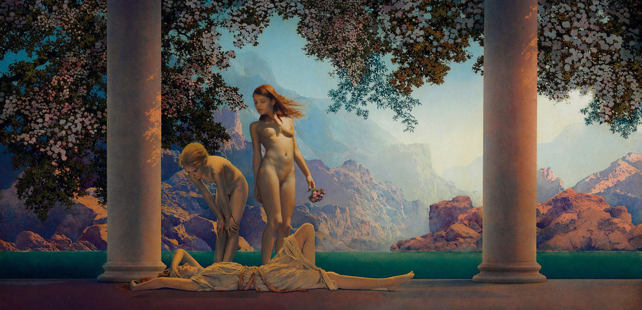
'Daybreak' is generally acknowledged to be Maxfield Parrish's outstanding masterpiece. Since two of his paintings have already been manipulated in this thread, I considered giving this picture a similar treatment. Surviving studies indicate that Parrish originally intended to place a third figure beside the righthand column, so perhaps it is not entirely outrageous to add a third character to the composition.

Parrish's picture is infused with the golden light of dawn, playing upon the figures in the foreground and upon the rocky landscape in the background. Whilst the work is substantially in the Classical tradition, an Impressionistic use of colour means that the shadows are rendered in tones of blue.

daybreak_after_maxfield_parrish_by_bobnearied_dfye6qu-fullview.jpg

(Image hosted on DeviantArt Sta.sh. Full size picture - https://sta.sh/01f258fdi5s3 )​

The golden light is rather challenging for inserting a new figure in Photoshop. We can make colour adjustments for the yellow highlights, and similar adjustments for the blue shadows, but attempting to do both together, on selected areas in the same layer, is very laborious. The solution is to superimpose separate masks for the blue shadows and the yellow highlights, to approximate the colour and lighting of the painted figures.

Using this technique, Alice accounts for eight layers out of a total of eleven. Rather than posing her beside the righthand column, I decided on a closer interaction with the first two characters, and so she joins her friend in persuading the reclining girl to undress for a morning swim. :)
 
Last edited:
'Daybreak' is generally acknowledged to be Maxfield Parrish's outstanding masterpiece. Since two of his paintings have already been manipulated in this thread, I considered giving this picture a similar treatment...Using this technique, Alice accounts for eight layers out of a total of eleven. Rather than posing her beside the righthand column, I decided on a closer interaction with the first two characters, and so she joins her friend in persuading the reclining girl to undress for a morning swim.
Is that what the girls are thinking about on this fine morning - a swim? Parrish might just have been that wholesome, I suppose. His girls are usually quite sexy, but often "decent". A sort of athletic or healthy outdoorsy sensuality, which means Alice fits right in.

This is a brilliant work, Bob. I mean, look at the sunlight and shadow work on Alice alone! Then there's the colour and texture work to make her fit into the texture of the painting. I swear, if Parrish saw it, he'd be all like "my Lord, I forgot to paint that girl a light suggestive toga-like dress that doesn't fool anyone!" Absolutely superb work. :thumbup: :beer:
 
Daybreak after Maxfield Parrish

'Daybreak' is generally acknowledged to be Maxfield Parrish's outstanding masterpiece. Since two of his paintings have already been manipulated in this thread, I considered giving this picture a similar treatment. Surviving studies indicate that Parrish originally intended to place a third figure beside the righthand column, so perhaps it is not entirely outrageous to add a third character to the composition.

Parrish's picture is infused with the golden light of dawn, playing upon the figures in the foreground and upon the rocky landscape in the background. Whilst the work is substantially in the Classical tradition, an Impressionistic use of colour means that the shadows are rendered in tones of blue.

daybreak_after_maxfield_parrish_by_bobnearied_dfye6qu-fullview.jpg

(Image hosted on DeviantArt Sta.sh. Full size picture - https://sta.sh/01f258fdi5s3 )​

The golden light is rather challenging for inserting a new figure in Photoshop. We can make colour adjustments for the yellow highlights, and similar adjustments for the blue shadows, but attempting to do both together, on selected areas in the same layer, is very laborious. The solution is to superimpose separate masks for the blue shadows and the yellow highlights, to approximate the colour and lighting of the painted figures.

Using this technique, Alice accounts for eight layers out of a total of eleven. Rather than posing her beside the righthand column, I decided on a closer interaction with the first two characters, and so she joins her friend in persuading the reclining girl to undress for a morning swim. :)
That, Bob, is just absolutely, breathtakingly, wondrously gorgeous! :) :clapping:
 
@bobinder, Maxfield Parrish is one of my favorite painters. His works have wonderful sense of color and dramatic and hopeful atmosphere.
Some people use Jean-Leon Gerome's work when using existing paintings as a background, but Parrish has a unique worldview that makes women look like fairies. I think your manip also develops that atmosphere very well.
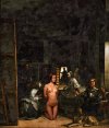
It's fun to make a manip with famous paintings. This is my old manip, using Velázquez's work. :cool:
 

Attachments

  • velazquez-las-meninas_olivia.jpg
    velazquez-las-meninas_olivia.jpg
    451 KB · Views: 410
@bobinder, Maxfield Parrish is one of my favorite painters. His works have wonderful sense of color and dramatic and hopeful atmosphere.
Some people use Jean-Leon Gerome's work when using existing paintings as a background, but Parrish has a unique worldview that makes women look like fairies. I think your manip also develops that atmosphere very well.
It's fun to make a manip with famous paintings. This is my old manip, using Velázquez's work. :cool:
The makings of a very erotic back story.
 
This is a brilliant work, Bob. I mean, look at the sunlight and shadow work on Alice alone! Then there's the colour and texture work to make her fit into the texture of the painting.
That's not a regular collage. It's visual artwork!
That, Bob, is just absolutely, breathtakingly, wondrously gorgeous! :) :clapping:
Parrish has a unique worldview that makes women look like fairies. I think your manip also develops that atmosphere very well.
Many thanks to everyone for the positive reception of 'Daybreak'. :)

It's fun to make a manip with famous paintings. This is my old manip, using Velázquez's work. :cool:

Cypher velazquez-las-meninas_olivia.jpg

The original occupants of Velasquez' studio have been effectively obscured and the Infanta deleted altogether, so that the kneeling nude female is now the centre of attention. Even the mirror on the rear wall, reflecting the faces of the King and Queen, has been changed for a crucifix, apparently hovering above the nude girl's shoulder. Whilst she appears incongruous, no explanation is offered for her presence.

Velasquez himself is just discernible on the left, working on a large canvas, whilst the royal household is represented by 'las Meninas' (the Ladies in Waiting) other members of the court, and the dwarves on the right. The murky atmosphere derives from a dark, overall treatment resembling heavily brushed varnish.

As viewers we cannot be quite certain what we are witnessing, and the visual effect is deliberately unclear, and open to interpretation. But presenting this scene as the patchy image of a half-remembered dream is entirely consistent with the artist's style, leaving us with more questions than answers. Congratulations on another provocative image, Cypher! :)
 
Daybreak after Maxfield Parrish

'Daybreak' is generally acknowledged to be Maxfield Parrish's outstanding masterpiece. Since two of his paintings have already been manipulated in this thread, I considered giving this picture a similar treatment. Surviving studies indicate that Parrish originally intended to place a third figure beside the righthand column, so perhaps it is not entirely outrageous to add a third character to the composition.

Parrish's picture is infused with the golden light of dawn, playing upon the figures in the foreground and upon the rocky landscape in the background. Whilst the work is substantially in the Classical tradition, an Impressionistic use of colour means that the shadows are rendered in tones of blue.

daybreak_after_maxfield_parrish_by_bobnearied_dfye6qu-fullview.jpg

(Image hosted on DeviantArt Sta.sh. Full size picture - https://sta.sh/01f258fdi5s3 )​

The golden light is rather challenging for inserting a new figure in Photoshop. We can make colour adjustments for the yellow highlights, and similar adjustments for the blue shadows, but attempting to do both together, on selected areas in the same layer, is very laborious. The solution is to superimpose separate masks for the blue shadows and the yellow highlights, to approximate the colour and lighting of the painted figures.

Using this technique, Alice accounts for eight layers out of a total of eleven. Rather than posing her beside the righthand column, I decided on a closer interaction with the first two characters, and so she joins her friend in persuading the reclining girl to undress for a morning swim. :)
So original ... amazing work . :number_one:
 
Last edited:
Back
Top Bottom