-
Sign up or login, and you'll have full access to opportunities of forum.
You are using an out of date browser. It may not display this or other websites correctly.
You should upgrade or use an alternative browser.
You should upgrade or use an alternative browser.
Original Manipulations by Cruxforums Members
- Thread starter Wragg
- Start date

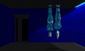
This might not be the first time that a government has left people hanging around!One I made years ago :
In the basements of a police station : two political opponents of the government left hanging after interrogation.
View attachment 972440

Nice image, Lox!

Cran
Governor
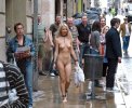
This is a manip I made. The picture was posted by @thehangingtree in Nude Out of Place and I got the assets from the Manip Contruction Kit. I'm suprised how well they fit.
I thought that she was dressed inappropriatly to be seen in public, so I fixed it so that she will be dressed more appropriately.
I added shadows, but I think maybe they look a bit artificial. I wasn't sure if they actually improve the picture, so I also uploaded the picture withouth them. I made the shadows on their own layer, so I was able to get rid of them by making that layer invisible.
With shadows:

Without shadows:
I thought that she was dressed inappropriatly to be seen in public, so I fixed it so that she will be dressed more appropriately.
I added shadows, but I think maybe they look a bit artificial. I wasn't sure if they actually improve the picture, so I also uploaded the picture withouth them. I made the shadows on their own layer, so I was able to get rid of them by making that layer invisible.
With shadows:

Without shadows:

Cran
Governor
I forgot to add thanks to @Madiosi for uploading, and linking me to the collar and shackles that I used for this picture.This is a manip I made. The picture was posted by @thehangingtree in Nude Out of Place and I got the assets from the Manip Contruction Kit. I'm suprised how well they fit.
I thought that she was dressed inappropriatly to be seen in public, so I fixed it so that she will be dressed more appropriately.
I added shadows, but I think maybe they look a bit artificial. I wasn't sure if they actually improve the picture, so I also uploaded the picture withouth them. I made the shadows on their own layer, so I was able to get rid of them by making that layer invisible.
With shadows:
View attachment 973364
Without shadows:
View attachment 973365
Cran
Governor
Thank you for your compliment!The collar and chain are definitely more convincing with the shadow - well done!

I can't exactly figure it out. I think maybe the shadow is too blured.
E-DigitalFantasy
Tribune
Wonderful manip! I like the one without the shadows as the clarity of the entire picture seems enhanced. It appears realistic due to plenty of light from the front and above.Thank you for your compliment!
I can't exactly figure it out. I think maybe the shadow is too blured.
Nice work. I'm not sure which version I like better. The shadows adds some realism, but I agree with EDF that the non-shadow version has a certain clarity. One could very easily try to imagine a story of how a chained slavegirl got out in public. I'm always surprised that none of the other people in the street seem to notice her at all.This is a manip I made. The picture was posted by @thehangingtree in Nude Out of Place and I got the assets from the Manip Contruction Kit. I'm suprised how well they fit.
I thought that she was dressed inappropriatly to be seen in public, so I fixed it so that she will be dressed more appropriately.
I added shadows, but I think maybe they look a bit artificial. I wasn't sure if they actually improve the picture, so I also uploaded the picture withouth them. I made the shadows on their own layer, so I was able to get rid of them by making that layer invisible.
With shadows:
View attachment 973364
Without shadows:
View attachment 973365

MahaShiva
Magistrate
I'll side with @bobinder and join the Yes on Shadows Camp. Without the shadows, the collar looks kind of flat or too thin, while the chain links look like they are digging into her skin. The blurring seems just about right to me; what you may want to do is to play with the opacity of the shadow layer a little to get to the look you like the best. My feeling is that the relatively thin chain links would not cast quite as dark a shadow as the collar in this highly diffused lighting.This is a manip I made. The picture was posted by @thehangingtree in Nude Out of Place and I got the assets from the Manip Contruction Kit. I'm suprised how well they fit.
I thought that she was dressed inappropriatly to be seen in public, so I fixed it so that she will be dressed more appropriately.
I added shadows, but I think maybe they look a bit artificial. I wasn't sure if they actually improve the picture, so I also uploaded the picture withouth them. I made the shadows on their own layer, so I was able to get rid of them by making that layer invisible.
With shadows:
View attachment 973364
Without shadows:
View attachment 973365
The other thing I would suggest, from the perspective of a pathological perfectionist, is to darken the flat parts on the side of the manacles on her right wrist and right ankle (what do you call those?), and also ever so slightly on the highlight on the front of the one on her ankle. These parts are in the shadow cast by her limbs, especially the one on the ankle, and do not have a lot of straight-on light to reflect.
Firstly, thank you so much for posting these, Cran, and secondly I think they are excellent! Yes, I'd join the shadow group, and you might try MahaShiva's improvements by way of embellishing a splendid image!This is a manip I made. The picture was posted by @thehangingtree in Nude Out of Place and I got the assets from the Manip Contruction Kit. I'm suprised how well they fit.
I thought that she was dressed inappropriatly to be seen in public, so I fixed it so that she will be dressed more appropriately.
I added shadows, but I think maybe they look a bit artificial. I wasn't sure if they actually improve the picture, so I also uploaded the picture withouth them. I made the shadows on their own layer, so I was able to get rid of them by making that layer invisible.
With shadows:
View attachment 973364
Without shadows:
View attachment 973365
Cran
Governor
Thank you everyone for the compliments! 
Last night, when I posted it was getting very late, and I think I closed the project without saving, even though a warning would have come up. I can't find it on my computer today, so I can't make the changes that have been suggested withoug redoing the picture. But, I will use them for the next slavegirl, who I see inappropriately dressed for the public.

Last night, when I posted it was getting very late, and I think I closed the project without saving, even though a warning would have come up. I can't find it on my computer today, so I can't make the changes that have been suggested withoug redoing the picture. But, I will use them for the next slavegirl, who I see inappropriately dressed for the public.
They don't notice her, because it is the proper way for a slavegirl to be dressed. She was just let out to do errands for her master.Nice work. I'm not sure which version I like better. The shadows adds some realism, but I agree with EDF that the non-shadow version has a certain clarity. One could very easily try to imagine a story of how a chained slavegirl got out in public. I'm always surprised that none of the other people in the street seem to notice her at all.
Cran
Governor
I thought they seemed so obediant and well trained, that it is a shame that they weren't collared, so I decided to fix that, as well as add aditional ornaments to their wrists and ankles. But I should be sure not to add to much, as they should never be overdressed. I wished I used a thicker bangles for their wrists and ankles.
I put work into darkening their collars, particularly on the undersides where they were too shiny and underneath their hair, but maybe they still pop out a bit too much. Their bangles don't pop out as much.

I put work into darkening their collars, particularly on the undersides where they were too shiny and underneath their hair, but maybe they still pop out a bit too much. Their bangles don't pop out as much.

Cran
Governor
I don't know if it is okay that I made a new post as an update, or should I have edited my previous post, but I made a few tweeks to try and improve it.
I increased the red and green levels in the shadows, to make them less grey, and I decreased the green and blue levels in the collar and bangles, so that they will match the colour temperature of the picture more, but maybe now they also look as if they are reflecting their skin tones.
I think the collars are still too sharp for the photograph.

It's fine to see them both, Cran, but you might have to ask a moderator if you need a previous post edited. These are nice, too, the girls seem pleased with their new adornments!don't know if it is okay that I made a new post as an update, or should I have edited my previous post,
Out of interest, which photo editing program are you using?
Cran
Governor
When I uploaded the second post, I still had time to edit the first one. I wasn't sure if it was better if I just made a second post, or should I have edited it into the first post.It's fine to see them both, Cran, but you might have to ask a moderator if you need a previous post edited. These are nice, too, the girls seem pleased with their new adornments!
Out of interest, which photo editing program are you using?
The program I'm using is Gimp. It is the only free photo editing programme that I know about.
Cran
Governor
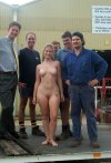
Here is a picture of some well maintained company properthy. This time, she is dressed to meet the company's regulation for slavegirls.
I put work into trying to shade her collar, but I think I might have darkened it too much, and made it blend into her skin a bit. I was trying to stop it from popping out too much. The lack of detail at the low resolution also makes it look a bit cartooney, but I think I fixed that a bit through shading, and adding a highlight along the edge.
I put work into trying to shade her collar, but I think I might have darkened it too much, and made it blend into her skin a bit. I was trying to stop it from popping out too much. The lack of detail at the low resolution also makes it look a bit cartooney, but I think I fixed that a bit through shading, and adding a highlight along the edge.

The result looks convincing enough, but you are discovering the limitations of working in a small scale and low resolution. If you start with such a small picture and enlarge it by 200%, you will have four times the original number of pixels to work with, which allows for much more flexibility and accuracy.Here is a picture of some well maintained company properthy. This time, she is dressed to meet the company's regulation for slavegirls.
I put work into trying to shade her collar, but I think I might have darkened it too much, and made it blend into her skin a bit. I was trying to stop it from popping out too much. The lack of detail at the low resolution also makes it look a bit cartooney, but I think I fixed that a bit through shading, and adding a highlight along the edge.

Other commenters have mentioned the use of opacity adjustments for fine-tuning an individual layer, and this is a useful technique for matching the density of a shadow with similar ones in the other figures and the background. Meanwhile, your determination to master such fine detail is commendable. Well done!

Cran
Governor
Thank you Bobinder!The result looks convincing enough, but you are discovering the limitations of working in a small scale and low resolution. If you start with such a small picture and enlarge it by 200%, you will have four times the original number of pixels to work with, which allows for much more flexibility and accuracy.
Other commenters have mentioned the use of opacity adjustments for fine-tuning an individual layer, and this is a useful technique for matching the density of a shadow with similar ones in the other figures and the background. Meanwhile, your determination to master such fine detail is commendable. Well done!
The collar I used had very uniformed lighting, so when downscaled to the lower resolution, it looked like a solid colour. I shaded it in by free selecting one area at a time, and changing the brightness for that area, and I used feathered edges to get the gradiants. If I use a higher resolution like you suggest, that detail might become more defined as I shade the collar, and preserved when I scale it down. Since I the collar was mostly a flat colour, selecting and chaning the brightness levels of an area had the same effect as just drawing over it with a solid gray, it looked like something I shaded using a digital brush rather than an actual photograph of a collar.
Cran
Governor
The girls a restless. Although they know what is in store for them after their recent enslavement, they are not willing to give up their freedom, and have never been naked in public before. However, they know that they that once enslaved they will never be allowed to reclaim thier freedom or former status, so they anxiously accept their fate.
Now, they will only be acknowleged as female bodies, so will always be kept naked with their breasts exposed, as that is what they must be from now on. It will be offensive for them to pretend to be something else, by not keeping their bodies constantly exposed. Although very nervous and ashamed, they understand what is now expected of them.
They are appropriately stripped naked and collared, but they have still not been properly prepared for slavery. Although their clothing have been confiscated and will soon be destroyed, their jewlery has not yet been taken, and their pubes have not yet been shaven. Since they are no longer allowed to hide them with cloths, they will forever be expected to keep keep their cunts bald and clean in public eye, and a slave must always keep herself well groomed.
I saw this a group of enslaved women, who accept what is happening to them, but still don't want to be slaves. I like to imagine a setting where female enslavement is common, and is casually accepted in society. No one wants to be enslaved, but are emotionally prepared for when it happens to them.
I used feather edges, when cutting of the collars underneath the hair. It turned out really good.
By chance, one of the girls in the picture is already wearing a leather cuff on her left wrist.

The scariest thing is 'Thickness up to 410mm'Here is a picture of some well maintained company properthy. This time, she is dressed to meet the company's regulation for slavegirls.
I put work into trying to shade her collar, but I think I might have darkened it too much, and made it blend into her skin a bit. I was trying to stop it from popping out too much. The lack of detail at the low resolution also makes it look a bit cartooney, but I think I fixed that a bit through shading, and adding a highlight along the edge.
View attachment 973628


