• Sign up or login, and you'll have full access to opportunities of forum.

Alice Kiss - Crux Legend

Go to CruxDreams.com
"Gentlemen, be careful!! Women have teeth!!" :cool:

be-careful-.jpg
Alice in a bathroom

alice-in-bathroom-1.jpg
I'm a little obsessed with putting Alice in one picture with a male actor.
But in this case, I wonder if she's just going to be treated as a boring porn actress.
I'm working on a few more now, but it's quite difficult to bring out her unique charm in scenes like this.
It seems that Alice's attractiveness has obviously something different from the appeal of an ordinary porn actress. :)
Like last time, I tried to make Alice get involved with a male actor. As I thought, it didn't really draw out her charm. She ended up looking like just an ordinary porn actress.
I'll try a different approach next time. :)
alice-in-bathroom-2-2.jpg

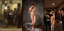
Cypher's boudoir scene, entitled 'Be careful', serves as a cautionary reminder of the power that women wield in the bedroom. Alice is presented as a supremely confident female, wound up with sexual tension and baring her teeth like a tigress. The reclining male is at her service, excited by the prospect of being mauled, as he prepares to experience the impending thrills.

The composition is effective because of its simplicity. The male on the bed fills the foreground, whilst in the centre Alice approaches on all fours, attracted by the very response that she has inspired. She is framed by the curtains of the background, giving the impression of a theatre stage. The performance is about to begin.

Cypher cf MPL cf Cypher teeth.jpg

Alexander Lobanov's portrait has proved to be popular with manip artists, and it has featured in an earlier picture by Cypher, entitled 'Rough and Mad Dentists'. The focus here is very much on the clenched teeth, in a dark and disturbing image of a painful extraction. In addition to the violence of the operation, the patient has been noosed, inexplicably and gripped by the throat. Again the composition locates Alice between the foreground component of the bloody tooth held in pliers, and the background window. Another male casually dons his shirt whilst looking towards the tooth. As viewers, we are invited to speculate about the nightmarish scene we are observing.

In the first of two bathroom scenes, Alice kneels submissively before another erection. She has been extracted from Peter Chupurov's picture, complete with her towel, which has been neatly trimmed to fit the manipulation. Her shoulder tattoo indicates that the image has been mirror-flipped, and Cypher has added leather cuffs to her wrists and ankles. The male's foot stands on the corner of the towel, which makes for a neat blending device, although his head is cropped out, and he is presented as an impersonal, faceless character. Whilst he demands attention, Alice is featured as the main subject of the picture.

Cypher cf Amour Angels calmness 54.jpg

In the second bathroom scene, Alice appears much more cheerful, and she no longer has the leather cuffs. This bold example of character interaction shows a sexually excited male placing his hand on her buttock as he leans over her. The second male standing on the left, providing the foreground component, is the same character who appears in 'Blackdreams' and 'Rough Looking Men'.

Alice has been mirror-flipped again, and the lighting has been balanced very successfully, considering that Valery Anzilov's source image was photographed in bright sunlight. The original photograph reveals a low viewpoint, with the feet very close to the camera. Cypher's use of lighting and colour balance creates the illusion of Alice crouching on the floor of the bathroom, in which the camera has a more elevated point of view. Short of making selective anatomical adjustments, the challenges presented by the relative figure proportions have been resolved to a large extent. Nice work, Cypher! :)

Cypher cf Femjoy LT46.jpg

Inserting a whole figure into a new environment is frequently an ambitious undertaking, considering the need for consistency in viewing angles, relative proportions and distances - to say nothing of consistent lighting, shadows and colour saturation.

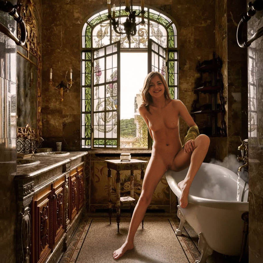
To date, I have only once attempted to place Alice in a bathroom, and she had to achieve three points of contact to appear convincing - seated on the rim of the bath, one foot on the floor and the other foot also on the rim. The pose, photographed by Vadim Rigin, makes sense if she is about to take a bath, so the running water and steam were added to give that impression. Manip artists will understand that various adjustments have to be made by trial and error, and quite often the resulting illusion of solid presence involves a degree of compromise.

The original caption states, 'For some reason, cleaning the numerous bathrooms has become one of the most popular tasks undertaken by the maids at Cruxton, and some of them have been known to spend many long hours engaged on this activity.' :D

The Bathroom at Cruxton Abbey

the_bathroom_at_cruxton_abbey_by_bobnearied_dg4oaw8-pre.jpg

(Image hosted on DeviantArt Sta.sh. Full size picture - https://sta.sh/0gtsqsfv8lp )​
 
Cypher's boudoir scene, entitled 'Be careful', serves as a cautionary reminder of the power that women wield in the bedroom. Alice is presented as a supremely confident female, wound up with sexual tension and baring her teeth like a tigress. The reclining male is at her service, excited by the prospect of being mauled, as he prepares to experience the impending thrills.

The composition is effective because of its simplicity. The male on the bed fills the foreground, whilst in the centre Alice approaches on all fours, attracted by the very response that she has inspired. She is framed by the curtains of the background, giving the impression of a theatre stage. The performance is about to begin.


Alexander Lobanov's portrait has proved to be popular with manip artists, and it has featured in an earlier picture by Cypher, entitled 'Rough and Mad Dentists'. The focus here is very much on the clenched teeth, in a dark and disturbing image of a painful extraction. In addition to the violence of the operation, the patient has been noosed, inexplicably and gripped by the throat. Again the composition locates Alice between the foreground component of the bloody tooth held in pliers, and the background window. Another male casually dons his shirt whilst looking towards the tooth. As viewers, we are invited to speculate about the nightmarish scene we are observing.

In the first of two bathroom scenes, Alice kneels submissively before another erection. She has been extracted from Peter Chupurov's picture, complete with her towel, which has been neatly trimmed to fit the manipulation. Her shoulder tattoo indicates that the image has been mirror-flipped, and Cypher has added leather cuffs to her wrists and ankles. The male's foot stands on the corner of the towel, which makes for a neat blending device, although his head is cropped out, and he is presented as an impersonal, faceless character. Whilst he demands attention, Alice is featured as the main subject of the picture.


Is there a full pic of slide two? Of her kneeling
 
Cypher's boudoir scene, entitled 'Be careful', serves as a cautionary reminder of the power that women wield in the bedroom. Alice is presented as a supremely confident female, wound up with sexual tension and baring her teeth like a tigress. The reclining male is at her service, excited by the prospect of being mauled, as he prepares to experience the impending thrills.

The composition is effective because of its simplicity. The male on the bed fills the foreground, whilst in the centre Alice approaches on all fours, attracted by the very response that she has inspired. She is framed by the curtains of the background, giving the impression of a theatre stage. The performance is about to begin.


Alexander Lobanov's portrait has proved to be popular with manip artists, and it has featured in an earlier picture by Cypher, entitled 'Rough and Mad Dentists'. The focus here is very much on the clenched teeth, in a dark and disturbing image of a painful extraction. In addition to the violence of the operation, the patient has been noosed, inexplicably and gripped by the throat. Again the composition locates Alice between the foreground component of the bloody tooth held in pliers, and the background window. Another male casually dons his shirt whilst looking towards the tooth. As viewers, we are invited to speculate about the nightmarish scene we are observing.

In the first of two bathroom scenes, Alice kneels submissively before another erection. She has been extracted from Peter Chupurov's picture, complete with her towel, which has been neatly trimmed to fit the manipulation. Her shoulder tattoo indicates that the image has been mirror-flipped, and Cypher has added leather cuffs to her wrists and ankles. The male's foot stands on the corner of the towel, which makes for a neat blending device, although his head is cropped out, and he is presented as an impersonal, faceless character. Whilst he demands attention, Alice is featured as the main subject of the picture.


In the second bathroom scene, Alice appears much more cheerful, and she no longer has the leather cuffs. This bold example of character interaction shows a sexually excited male placing his hand on her buttock as he leans over her. The second male standing on the left, providing the foreground component, is the same character who appears in 'Blackdreams' and 'Rough Looking Men'.

Alice has been mirror-flipped again, and the lighting has been balanced very successfully, considering that Valery Anzilov's source image was photographed in bright sunlight. The original photograph reveals a low viewpoint, with the feet very close to the camera. Cypher's use of lighting and colour balance creates the illusion of Alice crouching on the floor of the bathroom, in which the camera has a more elevated point of view. Short of making selective anatomical adjustments, the challenges presented by the relative figure proportions have been resolved to a large extent. Nice work, Cypher! :)


Inserting a whole figure into a new environment is frequently an ambitious undertaking, considering the need for consistency in viewing angles, relative proportions and distances - to say nothing of consistent lighting, shadows and colour saturation.

To date, I have only once attempted to place Alice in a bathroom, and she had to achieve three points of contact to appear convincing - seated on the rim of the bath, one foot on the floor and the other foot also on the rim. The pose, photographed by Vadim Rigin, makes sense if she is about to take a bath, so the running water and steam were added to give that impression. Manip artists will understand that various adjustments have to be made by trial and error, and quite often the resulting illusion of solid presence involves a degree of compromise.

The original caption states, 'For some reason, cleaning the numerous bathrooms has become one of the most popular tasks undertaken by the maids at Cruxton, and some of them have been known to spend many long hours engaged on this activity.' :D

The Bathroom at Cruxton Abbey

the_bathroom_at_cruxton_abbey_by_bobnearied_dg4oaw8-pre.jpg

(Image hosted on DeviantArt Sta.sh. Full size picture - https://sta.sh/0gtsqsfv8lp )​
The light , the shadows , her position ... Bob this is masterful . Even the selection of the background . She belongs there ... really great work .
 
Cypher's boudoir scene, entitled 'Be careful', serves as a cautionary reminder of the power that women wield in the bedroom. Alice is presented as a supremely confident female, wound up with sexual tension and baring her teeth like a tigress. The reclining male is at her service, excited by the prospect of being mauled, as he prepares to experience the impending thrills.

The composition is effective because of its simplicity. The male on the bed fills the foreground, whilst in the centre Alice approaches on all fours, attracted by the very response that she has inspired. She is framed by the curtains of the background, giving the impression of a theatre stage. The performance is about to begin.


Alexander Lobanov's portrait has proved to be popular with manip artists, and it has featured in an earlier picture by Cypher, entitled 'Rough and Mad Dentists'. The focus here is very much on the clenched teeth, in a dark and disturbing image of a painful extraction. In addition to the violence of the operation, the patient has been noosed, inexplicably and gripped by the throat. Again the composition locates Alice between the foreground component of the bloody tooth held in pliers, and the background window. Another male casually dons his shirt whilst looking towards the tooth. As viewers, we are invited to speculate about the nightmarish scene we are observing.

In the first of two bathroom scenes, Alice kneels submissively before another erection. She has been extracted from Peter Chupurov's picture, complete with her towel, which has been neatly trimmed to fit the manipulation. Her shoulder tattoo indicates that the image has been mirror-flipped, and Cypher has added leather cuffs to her wrists and ankles. The male's foot stands on the corner of the towel, which makes for a neat blending device, although his head is cropped out, and he is presented as an impersonal, faceless character. Whilst he demands attention, Alice is featured as the main subject of the picture.


In the second bathroom scene, Alice appears much more cheerful, and she no longer has the leather cuffs. This bold example of character interaction shows a sexually excited male placing his hand on her buttock as he leans over her. The second male standing on the left, providing the foreground component, is the same character who appears in 'Blackdreams' and 'Rough Looking Men'.

Alice has been mirror-flipped again, and the lighting has been balanced very successfully, considering that Valery Anzilov's source image was photographed in bright sunlight. The original photograph reveals a low viewpoint, with the feet very close to the camera. Cypher's use of lighting and colour balance creates the illusion of Alice crouching on the floor of the bathroom, in which the camera has a more elevated point of view. Short of making selective anatomical adjustments, the challenges presented by the relative figure proportions have been resolved to a large extent. Nice work, Cypher! :)


Inserting a whole figure into a new environment is frequently an ambitious undertaking, considering the need for consistency in viewing angles, relative proportions and distances - to say nothing of consistent lighting, shadows and colour saturation.

To date, I have only once attempted to place Alice in a bathroom, and she had to achieve three points of contact to appear convincing - seated on the rim of the bath, one foot on the floor and the other foot also on the rim. The pose, photographed by Vadim Rigin, makes sense if she is about to take a bath, so the running water and steam were added to give that impression. Manip artists will understand that various adjustments have to be made by trial and error, and quite often the resulting illusion of solid presence involves a degree of compromise.

The original caption states, 'For some reason, cleaning the numerous bathrooms has become one of the most popular tasks undertaken by the maids at Cruxton, and some of them have been known to spend many long hours engaged on this activity.' :D

The Bathroom at Cruxton Abbey

 
the_bathroom_at_cruxton_abbey_by_bobnearied_dg4oaw8-pre.jpg

(Image hosted on DeviantArt Sta.sh. Full size picture - https://sta.sh/0gtsqsfv8lp )​

Thank you for your kind and thoughtful commentary as always. "be careful" was made on the spur of the moment because the image with this unique expression had become a hot topic at that time. "dentist" is a very old manip. I'm a little surprised that you have. I believe it was posted on thedarkspot a long time ago. :cool:
Alice in your bathroom looks really great. She seems to be waiting for me to undress. I want to take a bath with her. :)
I have a feeling that sex scene images which I posted these days aren't doing very well . I feel like it doesn't have to be Alice to pose like that. I will try to change the aproch next time.

By the way, regarding the image of the dog proposed by @Mikerytel, the original picture is different, but I had made one, so I will attach it. People in the northern hemisphere who spend hot summers should enjoy the cool image.... :)

alice-in-snowfield-.jpg
 
sorry for the 5-year late reply
Model : Alice (Add - Sweat skin, Sweat drop, Whip Marks, Flies, Defaecation, Urination, Wet hair )
Background : Some Appain way and legionare on internet

I will post a new pictures in photoshop-crux forum

And a copy of Alice in this group

Enjoy
Love : St.Johny
 

Attachments

  • appianway.jpg
    appianway.jpg
    960.5 KB · Views: 393
Story by Eulalia

Crucifixa

My whiteness
catches the early rays.
A few men gather
to appreciate
my nakednessmost
are too busy.
Eighteen years’ girlhood
now displayed,
like this, for passers-by.
I could have got away
down this same road,
Ostia, freedom …
No. A girl alone
wouldn’t stand a chance –
and, anyway,
it’s what I asked for.
So I got ready,
bathed, oiled my skin,
brushed back my hair,
put on my dancing chiton,
simple, light,
sandals, hair-ribbon,
nothing else –
no make-up, gems.
Waited.
“Nice legs!” a soldier said
as he tied my wrists,
“But they need a tan –
we’ll see you get one!”
Those legs I fight to flex now,
lit by the light of dawn,
press down - the pain’s unbearable –
to ease the other agonies
in aching shoulders,
steel-tormented groin …
I teased my torturers,
“Come on!
In your job
you must’ve seen a naked girl before -
whip me!”
Their scourge
and searing irons have left
imperial signatures
on my hot, heaving adolescent breasts,
where flies are swarming now
to taste sweet sweat.
The sun lifts, angry red
above the marshes –
how soon my pale skin burns!
Heavy the cross-bar
that I had to haul
up this long hill,
thrashed when I stumbled.
Still, when they stripped me –
what I had left of blood-soaked rags –
I smiled, shook back my hair,
self-conscious, girly.
Nor did I struggle –
well, not much –
as they set me shuddering on the shaft,
stretched out slim arms –
so slim, so stretched now,
straining, they’re forced to bear
my body’s weight -
they strapped me down,
showed me the iron nails,
the heavy hammer,
grinning …
Ah! How we squeal,
vixens on heat, fillies in season,
girls, when we’re crucified!
Minutes, they watched me writhe,
peed on me – my lank locks
still stink of it -
then raised me slowly,
every muscle taut,
feeling the strain grow, inch by inch,
head back, lips wide, teeth clenched,
then –
Aaah!
The sickening jolt!
All my youth tugged
on four flesh-rending nails,
ripping racked girlhood!
Worse: in between my thighs
the Spike -
that special cruelty the Romans use
to consummate their virgin-victim's
honeymoon of pain!
First I fought, frenzied,
trying to tear
my fingers free from the firm-fixed nails.
At last,
I recognised, resigned:
there’s no escape.
Accept
the agony
that surges through
with every lunge
of my long, slow death-dance.
Yet still I strive with aching thighs
to ease my tortured sex
around the exploring Spike,
flex up my supple body,
feel how close
ecstatic pleasure lies to exquisite pain!
Excited schoolboys now observe
each throb
as the triumphant tool
invades my female parts,
province by province,
conquering me.
Tribute trickles purple
down my surrendered thighs,
drips for Rome’s soil to sup.
Wolf-whistles!
Word's got round,
"A pretty crucifixa on the Ostian Way!"
Youths jeer and joke,
their girl-friends giggle and gloat.
Older men ogle me, lay bets...
"She's suffering,
that slave-slut -
so she should!"
hisses a hag.
Submit.
It's what they like to see....
Breasts that will never nourish,
hips that will never bear,
toss, thrust, tormented.
Parched lips panting,
schoolgirl teeth flash in the sun,
sun-baked, thirst-maddened,
frantic, I twist my head,
try to suck sweat off my shoulder.
with flesh-gnawing flies -
each breath is agony …
Ah, crucifixion!
Summit of sadist’s skill!
Making me, every sinew taut,
torture – and fuck - myself!
Noonday.
No rest.
Head hangs exhausted.
Crows investigate –
I toss my tousled curls:
not time yet boys!
“Caw!”
They just mock me.
Soon they’ll start pecking -
first my soft eyes …
And yet I know
it’s only the beginning...
I’ve seen girls young as me
hanging like I am now,
still twitching, gasping,
whimpering in pain,
on the third day...​
Enjoy
saintjohny
 

Attachments

  • Ostianway.jpg
    Ostianway.jpg
    944.6 KB · Views: 372
After enjoying various sex adventures, including raceplay, during this summer vacation, Alice is back at school.
However, her bad behavior seems to have been exposed. Her school is very strict about discipline for students. :cool:
summer-vacation is over.jpg
Alice is enjoying considerable popularity, now that @saintjohny is celebrating a welcome return to Cruxforums, with variations of his 'Appian Way/Ostian Way' crux manip, and @cypher continues his Alice series using an MPL source coincidentally also employed by @GoatJr . With three pictures by established Alice manip artists competing for reviews, I shall look initially at the two pictures which make use of Alexander Lobanov's studio pose for MPL's 'Basic Instinct'.

GoatJr's picture appeared in the thread, 'Original Manipulations by Cruxforums Members' with an extended caption, explaining how Alice becomes the new model for the artist who is seeking inspiration - https://www.cruxforums.com/xf/threads/original-manipulations-by-cruxforums-members.8463/post-803765

She has been inserted behind the artist's chair, in a way which allows the form of the chair to repeat the shape of her right leg. Her eyes have been moved to focus on the canvas, rather than looking directly at the viewer, as in the source image.

GoatJr poser cf MPL26 cf Cypher vacation.jpg

The composition is neatly balanced by the second girl, on the right. Despite the deep shadows, her form is highlighted by some delicate lighting, which is consistent with the daylight coming from the left of the picture. I am not familiar with the original background image, which appears to be a Dutch genre painting, depicting a marine artist at work, surrounded by his reference items - a large model ship, a globe and a map - being observed by the female in the background. Perhaps he wants to paint Alice in a seascape?

The two models contribute to a balanced composition and change the original relationship between the artist and the clothed female, into one in which she is keeping a close eye on his behaviour in the presence of the two nude models. We catch a glimpse of a nipple from each of the girls, but modesty is otherwise preserved in a scene which is almost safe for work, and makes an altogether attractive impression. Nice work, GoatJr! :)

Cypher's latest picture appeared three days later, using the identical pose by Alice, from the 'Basic Instinct' series. Whilst Cypher might have been inspired by the old master styling of GoatJr's composition, the use of the pose is probably coincidental, and in fact the legs have been modified to resolve the obstruction presented by the studio prop ladder, and also to receive the white socks and T-bars so evocative of a fashion conscious senior student.

Cypher vacation cf MPL26.jpg

This curious establishment is obviously some kind of training college where all the girls seem to be receiving the same kind of 'education'. Indeed, Alice's pose is quite suitable for portraying the uncomfortable examination to which she is being subjected, whilst the master on the left flexes his cane, and the mistress expresses her evident disapproval of the non-regulation lace panties she has recently obtained from her student.

Cypher's formula for composition presents Alice on centre stage, with a character on either side, close up in the foreground, and other students obediently facing the wall in the background. The arrangement provides a sense of depth to the scene, implying that we are present as observers, as well as illustrating the specific treatment Alice is about to receive. This is another neatly blended example of convincing photo-realism - well done, Cypher! :)
 
Alice is enjoying considerable popularity, now that @saintjohny is celebrating a welcome return to Cruxforums, with variations of his 'Appian Way/Ostian Way' crux manip, and @cypher continues his Alice series using an MPL source coincidentally also employed by @GoatJr . With three pictures by established Alice manip artists competing for reviews, I shall look initially at the two pictures which make use of Alexander Lobanov's studio pose for MPL's 'Basic Instinct'.

GoatJr's picture appeared in the thread, 'Original Manipulations by Cruxforums Members' with an extended caption, explaining how Alice becomes the new model for the artist who is seeking inspiration - https://www.cruxforums.com/xf/threads/original-manipulations-by-cruxforums-members.8463/post-803765

She has been inserted behind the artist's chair, in a way which allows the form of the chair to repeat the shape of her right leg. Her eyes have been moved to focus on the canvas, rather than looking directly at the viewer, as in the source image.


The composition is neatly balanced by the second girl, on the right. Despite the deep shadows, her form is highlighted by some delicate lighting, which is consistent with the daylight coming from the left of the picture. I am not familiar with the original background image, which appears to be a Dutch genre painting, depicting a marine artist at work, surrounded by his reference items - a large model ship, a globe and a map - being observed by the female in the background. Perhaps he wants to paint Alice in a seascape?

The two models contribute to a balanced composition and change the original relationship between the artist and the clothed female, into one in which she is keeping a close eye on his behaviour in the presence of the two nude models. We catch a glimpse of a nipple from each of the girls, but modesty is otherwise preserved in a scene which is almost safe for work, and makes an altogether attractive impression. Nice work, GoatJr! :)

Cypher's latest picture appeared three days later, using the identical pose by Alice, from the 'Basic Instinct' series. Whilst Cypher might have been inspired by the old master styling of GoatJr's composition, the use of the pose is probably coincidental, and in fact the legs have been modified to resolve the obstruction presented by the studio prop ladder, and also to receive the white socks and T-bars so evocative of a fashion conscious senior student.


This curious establishment is obviously some kind of training college where all the girls seem to be receiving the same kind of 'education'. Indeed, Alice's pose is quite suitable for portraying the uncomfortable examination to which she is being subjected, whilst the master on the left flexes his cane, and the mistress expresses her evident disapproval of the non-regulation lace panties she has recently obtained from her student.

Cypher's formula for composition presents Alice on centre stage, with a character on either side, close up in the foreground, and other students obediently facing the wall in the background. The arrangement provides a sense of depth to the scene, implying that we are present as observers, as well as illustrating the specific treatment Alice is about to receive. This is another neatly blended example of convincing photo-realism - well done, Cypher! :)
Alice pic 2 is sexy. Good for "research" :)
 
sorry for the 5-year late reply
Model : Alice (Add - Sweat skin, Sweat drop, Whip Marks, Flies, Defaecation, Urination, Wet hair )
Background : Some Appain way and legionare on internet

I will post a new pictures in photoshop-crux forum
https://www.cruxforums.com/xf/threads/photoshop-crux.710/
And a copy of Alice in this group

Enjoy
Love : St.Johny

I am delighted to see that @saintjohny has returned to Cruxforums. Not only is he one of the early manip artists producing crux art in a high quality photo-realistic style, but he made extensive use of poses by models from both Cruxdreams and Orchid Studios. This resulted in the production of numerous images featuring Alice, either in isolation or in the company of other crux stars such as Orchid's Katrina.

https://www.cruxforums.com/xf/threads/alice-kiss-crux-legend.6168/post-321279
https://www.cruxforums.com/xf/threads/alice-kiss-crux-legend.6168/post-321433
https://www.cruxforums.com/xf/threads/alice-kiss-crux-legend.6168/post-325489
https://www.cruxforums.com/xf/threads/alice-kiss-crux-legend.6168/post-325493

Only two months ago, I referenced two saintjohny pictures in a post celebrating the sixteenth anniversary of the 'Crux Forest' session, and my own picture on that occasion was directly inspired by saintjohny's work with Alice.

https://www.cruxforums.com/xf/threads/alice-kiss-crux-legend.6168/post-792323

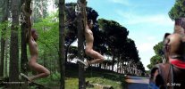
It is therefore entirely appropriate that he should make his comeback with a new picture of Alice, derived from Makar's dramatic profile view of her crucified in the forest. Saintjohny has wasted no time in producing three versions of his 'Via Appia' themed manip in high resolution, in addition to a manipulation of Makar's original picture. In the latter, Alice's hair is darkened to reveal some extra, long strands within the shadow on her back, whip matks and perspiration effects have been added, along with increased contrast and some other features indicating a high level of distress.

Makar cf Saintjohny Alice.jpg

The manipulated figure has then been transferred to a new background, depicting the Via Appia, parts of which remain substantally unchanged from Roman times. The ancient, paved avenue has a grainy texture, which seems suitable for the gritty depiction of crucifixion, which may be unique as an ultra realistic portrayal of a commonplace event in a photo manipulation which combines the erotic with the horrific. Approaching as casual viewers, we are intended to stop and stare at the shocking spectacle, simultaneously evocative of beauty and revulsion. We are compelled to watch, and never forget the image impressed upon our psyche.

Makar cf Saintjohny Appian Way Alice.jpg

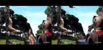
A Roman sentry fills the right foreground, defocused to present the scene of suffering in full, explicit detail. In a second version of the picture, he is escorting Katrina, also whipped and perspiring. With her wrists chained behind her back, she stares directly out of the picture, and there can be no doubt about her impending fate.

Saintjohny Appianway cf Ostianway.jpg

Saintjohny's latest version is renamed from the Appian Way to the 'Ostian Way', to illustrate Eulalia's 'Crucifixa' poem. The most obvious differences are the witnesses seen beyond the sentry on the right. A female gazes approvingly at Alice, whilst her companion is largely obscured by the sentry. As if Alice's torments could only increase, she is now assailed by the swarms of flies which are attracted by the pervading scent of her ordeal, and the crows have also arrived. The birds will take an interest in the flies initially, but eventually they will dispose of the main course.

Congratulations on a sensational series of pictures, saintjohny! :)
 
Saintjohny's latest manip is a dramatic nocturne, featuring Alice crucified in a forest. She has now provided the inspiration for two new works and associated variations, published since SaintJohny's return to Cruxforums earlier this month. The full size picture appears in Saintjohny's thread, 'Photoshop Crux' -
https://www.cruxforums.com/xf/threads/photoshop-crux.710/post-806213

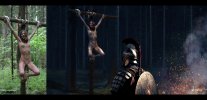
The new composition presents a sense of depth by locating a sentry in the centre foreground, looking at Alice, crucified a few yards away on the left, and placing the light source. a roaring camp fire, in the right foreground. Whilst we do not see the flames, the smoke and embers are rising, and the fire is reflected in the high contrast of the sentry's shining armour, as well as on Alice's skin. The cross also receives orange firelight, and casts a shadow diagonally across the lower left corner. The lighting is therefore consistent in terms of colour and direction.

Makar cf Saintjohny Alice untitled.jpg

The numerous trees are dimly illuminated in the distance, and the crucified figure is highlighted against the pervading darkness. This allows a wide range of colour treatments on the skin, so the blue shadows appear just as well defined as the brightly lit areas. The figure repays a close examination for the details of whip marks, bruising and shiny beads of perspiration running downwards from the arms and face, over the breasts and torso, and onto the thighs.

Saintjohny Alice untitled detail 145pc.jpg

Increased contrast and gamma value accentuate the tension in Alice's expression and pose. Makar's ropes are brilliantly highlighted, demonstrating precisely how the figure is suspended. Alice's arms are at full stretch and her legs are open and relatively relaxed, indicating a degree of painful exhaustion after straining actively against the cross. She looks directly at us, avoiding eye contact with the sentry, although she knows he is observing her closely. Whilst he is presented as an impersonal, faceless figure, shrouded in armour, the character interaction is complete. With a mixture of mail and plate armour, and a round shield and short spear carried on his back, he defines an ancient period in time, but not apparently Roman.

Small points of light appear below Alice's legs, suggesting that something is reflecting the firelight in the distance. The Cruxdreams patibulum has been extracted complete, from the source image, and the lower part of the cross has been blended into the trunk of another tree. The whole picture is beautifully detailed and finely balanced in terms of the colouring and composition. It presents a convincing sense of realism, and an atmosphere of tension between the characters. Nice work, @saintjohny ! :)
 
Saintjohny's latest manip is a dramatic nocturne, featuring Alice crucified in a forest. She has now provided the inspiration for two new works and associated variations, published since SaintJohny's return to Cruxforums earlier this month. The full size picture appears in Saintjohny's thread, 'Photoshop Crux' -
https://www.cruxforums.com/xf/threads/photoshop-crux.710/post-806213

The new composition presents a sense of depth by locating a sentry in the centre foreground, looking at Alice, crucified a few yards away on the left, and placing the light source. a roaring camp fire, in the right foreground. Whilst we do not see the flames, the smoke and embers are rising, and the fire is reflected in the high contrast of the sentry's shining armour, as well as on Alice's skin. The cross also receives orange firelight, and casts a shadow diagonally across the lower left corner. The lighting is therefore consistent in terms of colour and direction.


The numerous trees are dimly illuminated in the distance, and the crucified figure is highlighted against the pervading darkness. This allows a wide range of colour treatments on the skin, so the blue shadows appear just as well defined as the brightly lit areas. The figure repays a close examination for the details of whip marks, bruising and shiny beads of perspiration running downwards from the arms and face, over the breasts and torso, and onto the thighs.


Increased contrast and gamma value accentuate the tension in Alice's expression and pose. Makar's ropes are brilliantly highlighted, demonstrating precisely how the figure is suspended. Alice's arms are at full stretch and her legs are open and relatively relaxed, indicating a degree of painful exhaustion after straining actively against the cross. She looks directly at us, avoiding eye contact with the sentry, although she knows he is observing her closely. Whilst he is presented as an impersonal, faceless figure, shrouded in armour, the character interaction is complete. With a mixture of mail and plate armour, and a round shield and short spear carried on his back, he defines an ancient period in time, but not apparently Roman.

Small points of light appear below Alice's legs, suggesting that something is reflecting the firelight in the distance. The Cruxdreams patibulum has been extracted complete, from the source image, and the lower part of the cross has been blended into the trunk of another tree. The whole picture is beautifully detailed and finely balanced in terms of the colouring and composition. It presents a convincing sense of realism, and an atmosphere of tension between the characters. Nice work, @saintjohny ! :)
The centurions are staying wide awake gazing her petite heavenly form
 
Back
Top Bottom